Today we are releasing the new Frontend v7 , the most capable version of the uRADMonitor map interface to date. Following the previous results implemented in the last version, the new Frontend 07 is built on OpenLayers 10, runs entirely in the browser with no plugins, and works on desktop and mobile alike. If you didn’t see it yet, check it out now.
Let’s see what’s new in this release:
A unified, single-page interface
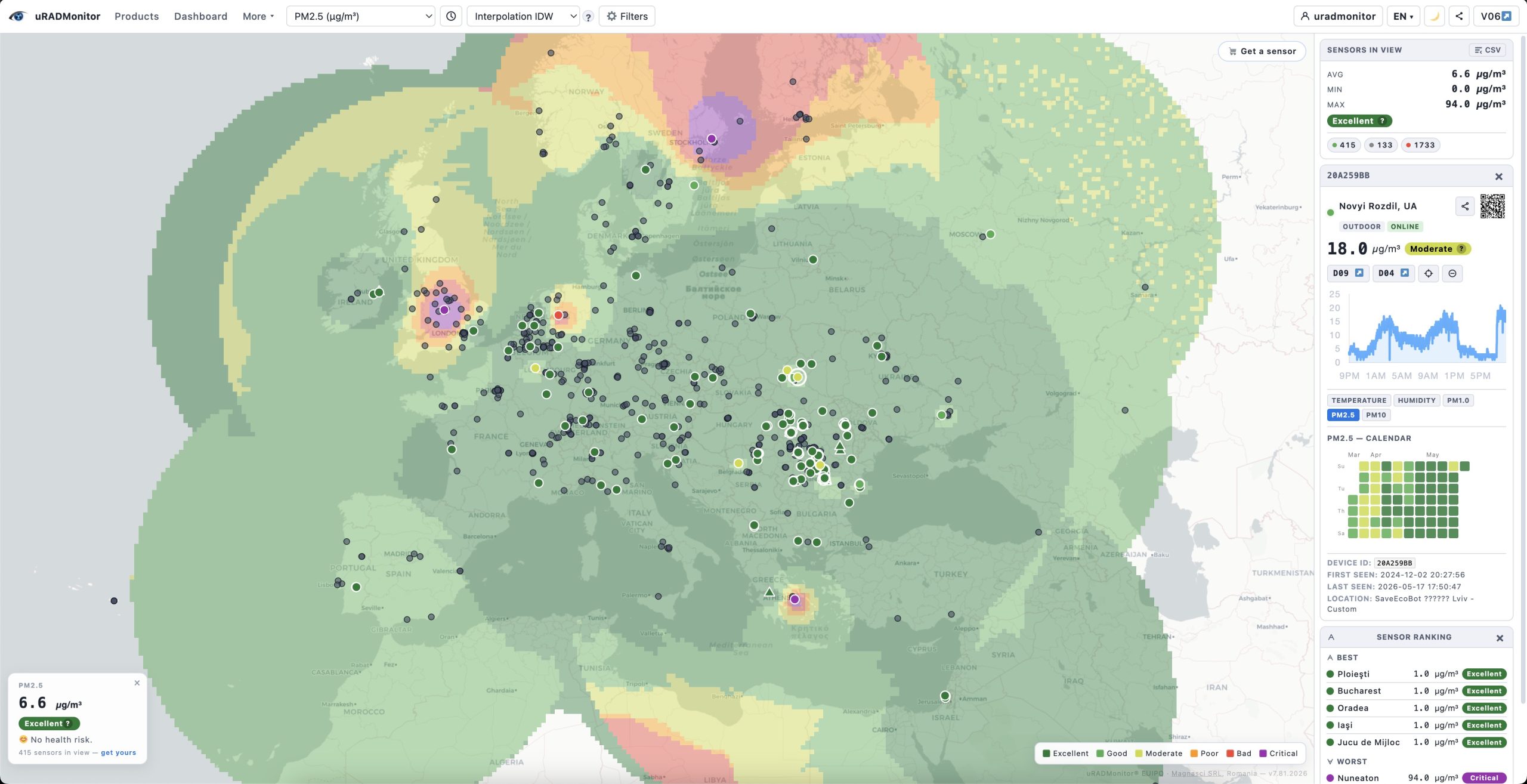
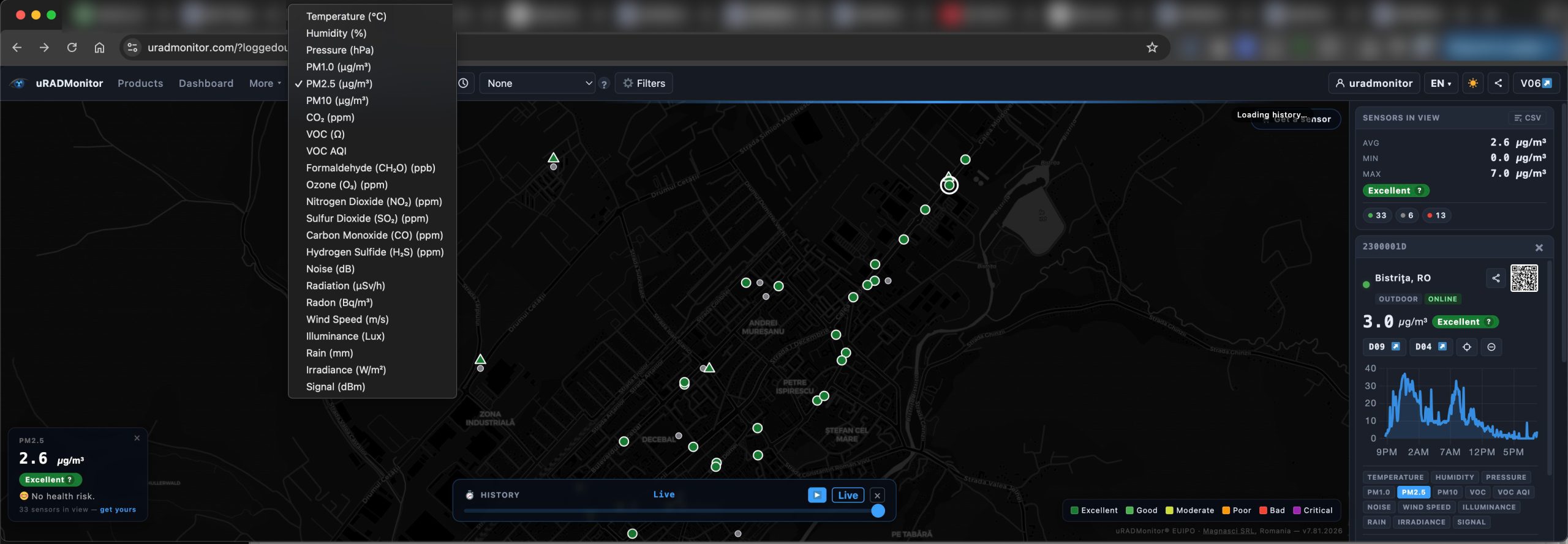
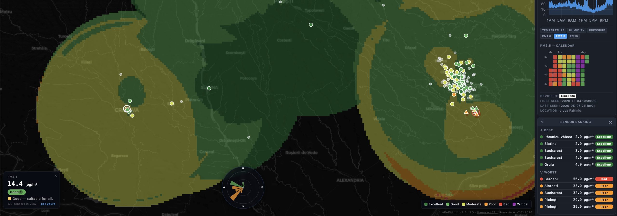
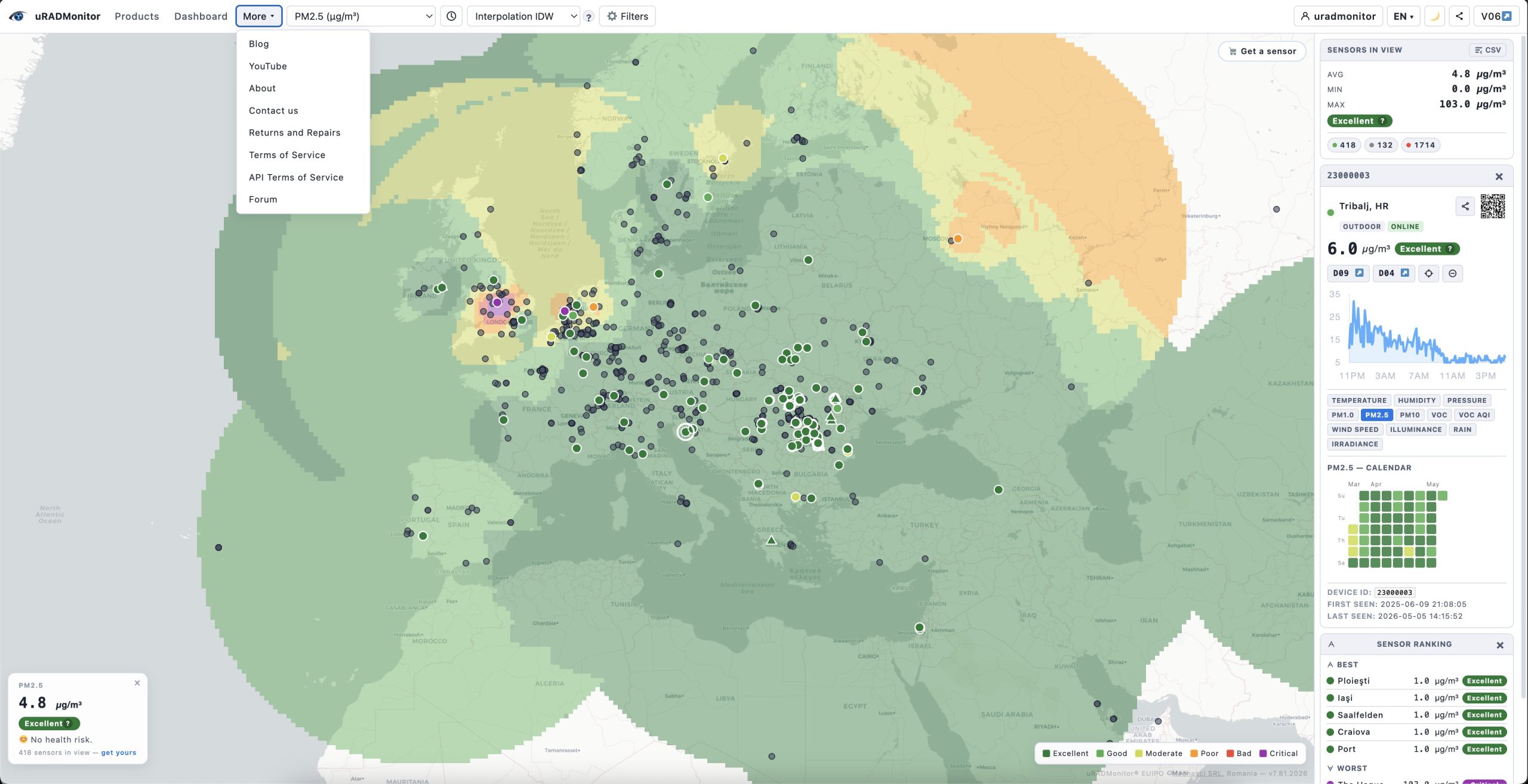
The old v6 frontend opened settings in a floating popup. Dashboard 10 places everything in a clean toolbar at the top of the screen: parameter selector, time range, overlay mode, filters, language, theme toggle, and share controls , all are visible at a glance, none buried in menus.
The sidebar on the right shows three cards: Sensors in View (live statistics), Legend (colour thresholds for the selected parameter), and Device Details (when a sensor is selected). On mobile, the sidebar moves to the bottom and the toolbar collapses into a hamburger menu, keeping the map front and centre.
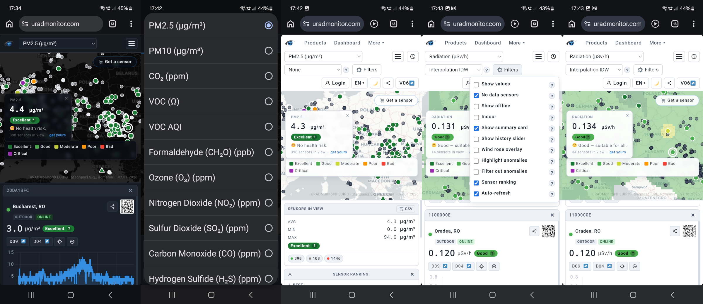
x19 parameters, including named gases
Given the uRADMonitor hardware diversity and the multitude of parameters monitored by our sensors, the interface has a generous selection and displays almost every parameter the uRADMonitor network reports. This includes:
Air quality: PM1.0, PM2.5, PM10, CO₂, VOC, VOC AQI, Formaldehyde (CH₂O)
Toxic gases: O₃, NO₂, SO₂, CO, H₂S , correctly resolved through the name1–name4 / gas1–gas4 firmware slots. Sensors like the uRADMonitor INDUSTRIAL or the uRADMonitor CITY support custom configurations , where each of the 4 slots can be used to install a specific gas sensor, so this system solves the technical setup in a convenient way – the gas cell type is automatically detected by the sensor.
Radiation: CPM → µSv/h (device-specific conversion factor applied automatically), Radon
Climate: Temperature, Humidity, Pressure, Noise
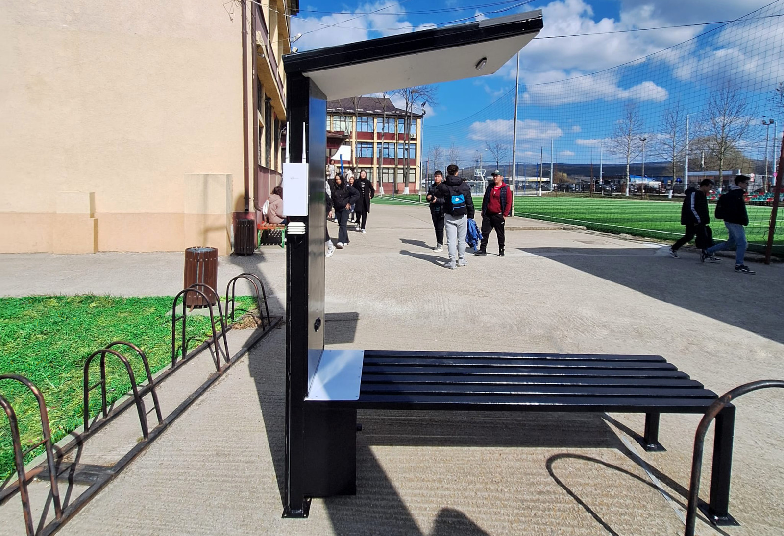
Meteorological (measured with the soon to be reseleased, new uRADMonitor MODEL METEO): Wind Speed, Illuminance, Rain accumulation, Solar Irradiance, Signal strength (for GSM / LoRaWAN or WIFI):
Every parameter has a dedicated six-band colour scale (Excellent → Critical), threshold values, unit display, and a contextual help text accessible via the ? button in the legend. Meteorological parameters carry their own impact vocabulary — Calm / Light / Moderate / Strong / Gale / Storm for wind, Dark / Dim / Moderate / Bright / Very Bright / Intense for illuminance, and so on.
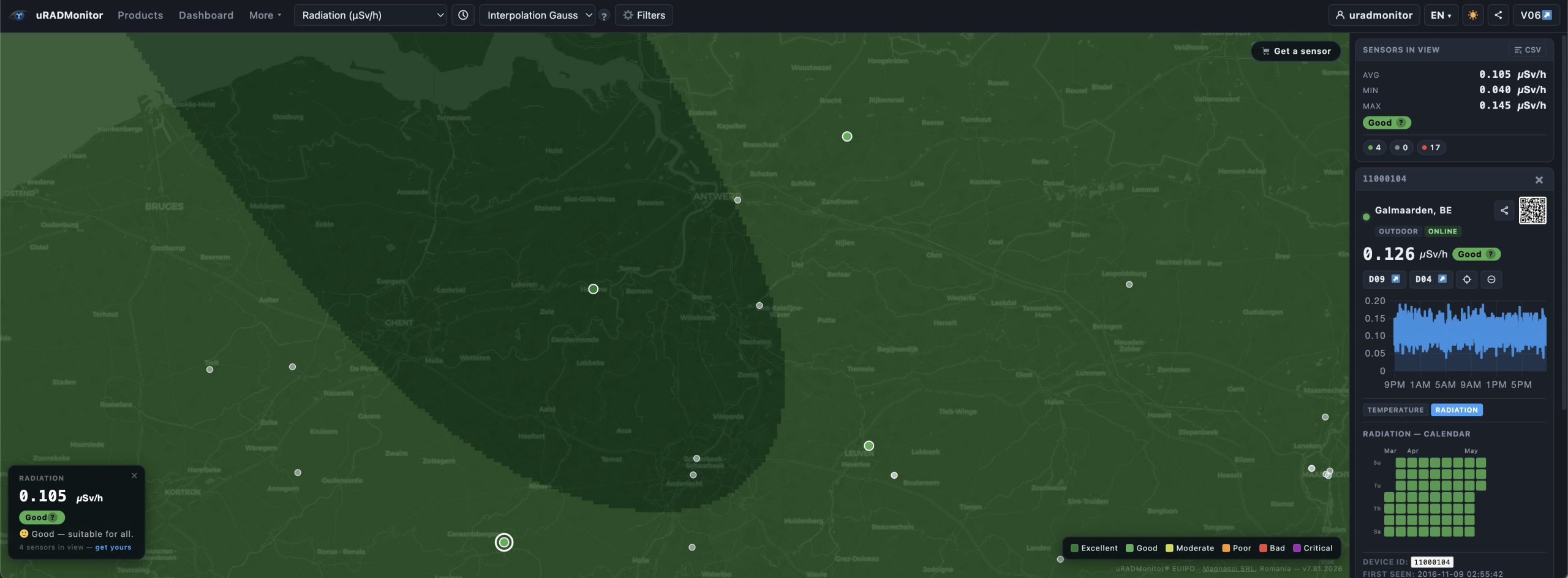
Four interpolation overlays
Beyond simple coloured dots, the new frontend v7 offers four ways to visualise spatial air quality:
- Density – an OpenLayers heatmap that highlights areas with many sensors, regardless of their values. Useful for understanding network coverage.
- Interpolation IDW – Inverse Distance Weighting (power 2, radius 15% of the current map view). Fast and sharp near sensors, transparent elsewhere.
- Interpolation Gauss – Gaussian falloff (σ = 12% of the view diagonal). Smoother, more natural transitions between measurement points.
All overlays respect the active filters: offline sensors, indoor sensors, disabled sensors, and detected anomalies are excluded from interpolation calculations, so a single malfunctioning unit cannot distort the picture.
History Slider with animation
Now – this is a hot one, and was also a part of v6 as a late addition to the previous frontend. Like with most upgrades , we made it better: at zoom level 10 and above, a History Slider appears at the bottom of the map. It covers the last 24 hours in 48 steps of 30 minutes each. Drag the handle to scrub backwards in time, or press ▶ Play to animate the full 24-hour sequence automatically.
While the slider is active, the sensor colours update to reflect the measured values at that moment in time, using the snapshot API. The Wind Rose overlay (see section 7) also updates to match the selected timestamp.
Mobile device trails
uRADMonitor Mobile sensors were a first. Introduced in 2016 on public transportation in partnership with Orange Romania, they generated unprecedented spatial resolution measurements. Like before, the map shows sensors installed in vehicles or carried by people with a triangle marker instead of a circle. Click any mobile sensor to open its detail card, then press ▶ Play Trail to animate its GPS path over the last 24 hours.
During the animation, a moving dot traces the route on the map while a yellow vertical line sweeps across the historical chart in the detail card , both are synchronised to the same point in time, so you can correlate location with measured values.
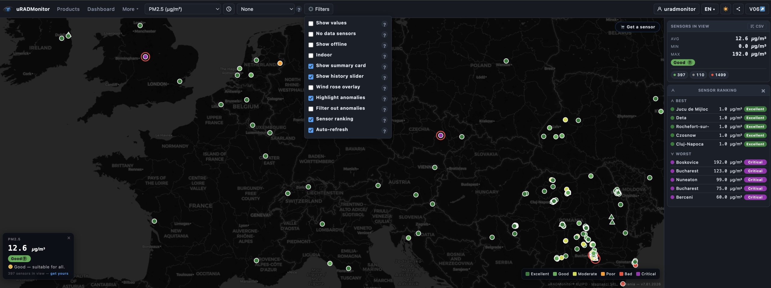
Anomaly detection and sensor management
While the Data server already filters the datasets and flags sensor errors so the owners can take action, we now have two complementary tools for data quality in the frontend as well:
Highlight anomalies : computes the mean and standard deviation for all visible sensors with the selected parameter. Any sensor reading more than 2.5σ above the mean gets a red ring. Sensors with physically implausible values (PM2.5 > 1000 µg/m³, CO₂ > 5000 ppm, NO₂ > 100 ppm, CO > 10 ppm, CH₂O > 2000 ppb) are flagged automatically.
Filter out anomalies : removes flagged sensors from the map, from all overlay calculations, and from the average displayed in the summary card and ranking. Use both options together: highlight first to see what is flagged, then filter to clean up the view.
Disable / Enable sensor : any individual sensor can be manually disabled. It remains visible as a grey dot (so you know it exists) but is excluded from every calculation: averages, overlays, ranking, and the summary card. Re-enable it at any time from the device detail card.
Wind Rose overlay
Enable Wind Rose in the Filters menu to fetch the last 24 hours of wind data for the current map centre from Open-Meteo , a free, open meteorological API included now with v7.0. The rose is rendered as a 16-sector SVG directly on the map:
- Petal length = direction frequency
- Petal colour = mean wind speed (green < 2 m/s → orange < 5 → red < 10 → purple above)
The rose updates automatically when you pan significantly, and also when you scrub the History Slider , it fetches the archive data for the selected day from Open-Meteo’s historical endpoint. So you have the clear picture on air quality evolution while using the slider.
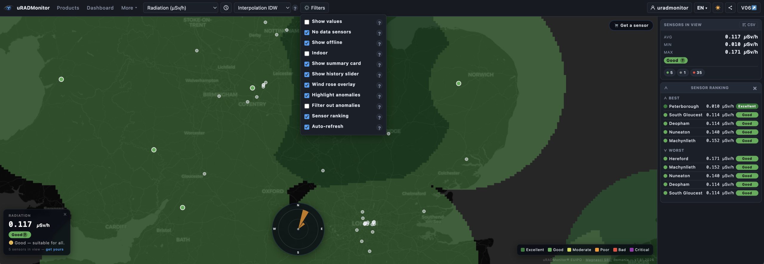
Sensor Ranking
The Sensor Ranking card in the sidebar shows the top 5 cleanest and top 5 most polluted sensors currently visible in the map view, for the active parameter. Rankings update as you pan and zoom. Click any row to jump to that sensor on the map and open its detail card.
Ranking respects all active filters: disabled sensors, offline sensors (if not shown), and anomalies (if filtered) are excluded!
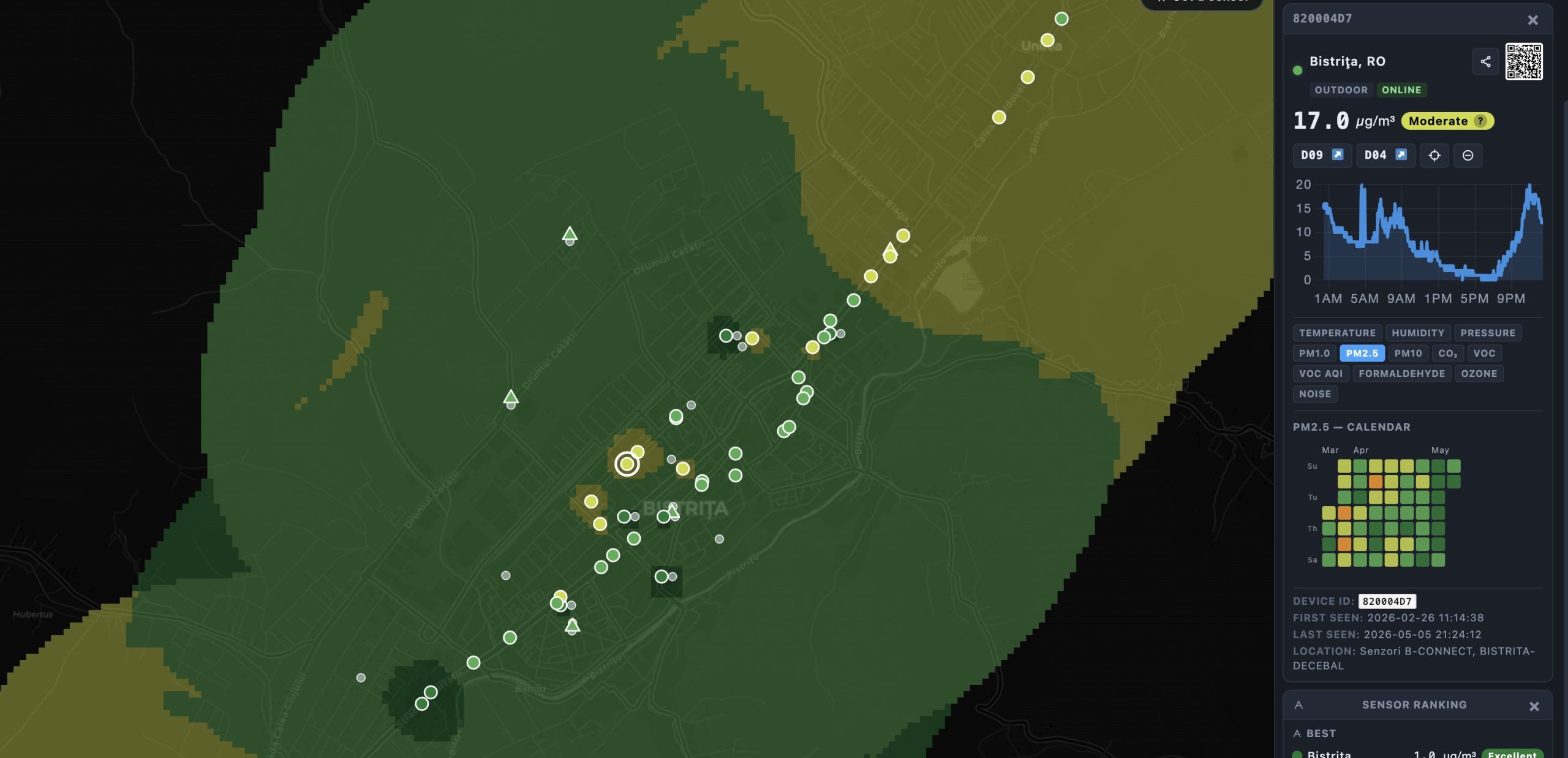
Device detail: chart, 90-day calendar, and QR code for sharing
Clicking any sensor opens the detail card with:
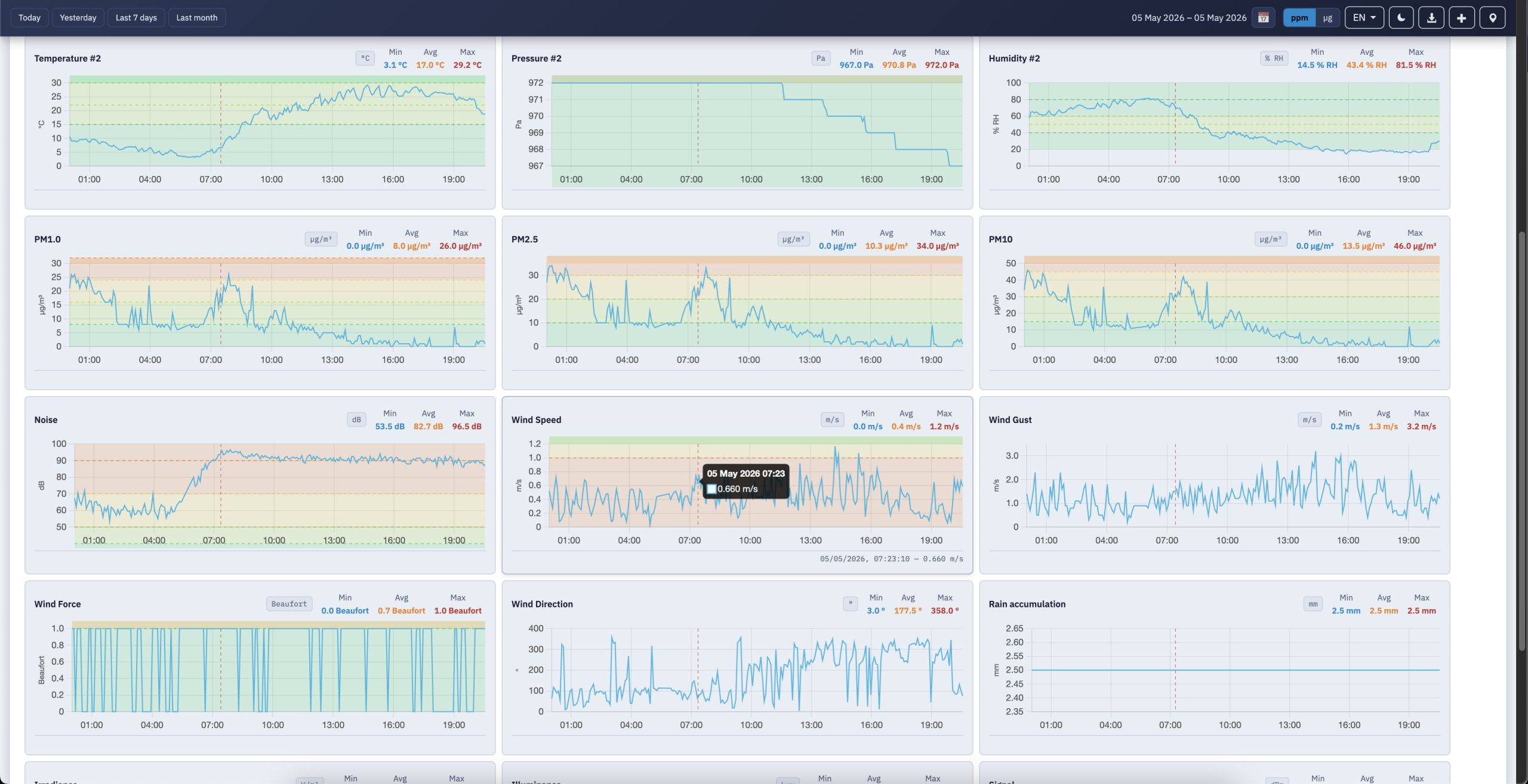
- History chart for the selected parameter and time range
- 90-day calendar heatmap using the daily averages API (
/average) , efficient one API call, one row per day, colour-coded by quality band. This is super useful for seeing weekly patterns . - QR code generated locally (no external service) that links to the powerful new Dashboard 09 for that specific device , useful for sharing a single sensor’s full analytics view
- Share sensor button that copies a direct URL with the map centred and zoomed on that device!
- Center on device button (⊕) for quick zoom
- Disable sensor button to exclude it from all calculations
Share View and Export CSV
Share View (◈ button in the toolbar) encodes the complete state of the dashboard into a URL: map position, zoom, selected parameter, time preset, overlay mode, and all active filter flags. Anyone opening the link sees exactly the same view.
Export CSV (button in the Sensors in View card header) downloads a CSV file of all sensors currently visible in the map view, with their coordinates, placement, status, current value, quality band, and last-seen timestamp.
Six languages, automatic dark/light them
The new Frontend-7.0 is fully translated into English, Romanian, German, French, Spanish, and Italian, including parameter names, filter labels, quality band names, health impact messages, and all help texts. Switch language from the toolbar; the interface rebuilds instantly without a page reload.
The theme switches automatically between light (07:00–19:00 local time) and dark (19:00–07:00). Once you press the ☀/🌙 button, the automatic switching stops and your choice is remembered for the session.
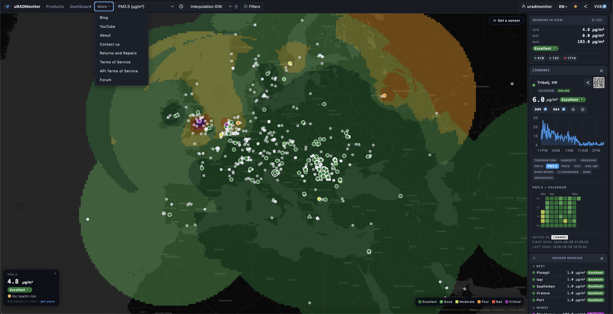
WordPress integration and unified navigation
Dashboard v7 is designed to work both as a standalone tool and embedded inside a WordPress page template. When embedded, you can pass a $navItems array from PHP to inject your site navigation directly into the dashboard toolbar , Products, Dashboard, More (with dropdown), and user login/logout and so creating a single unified navigation bar with no separate WordPress navbar needed.
The library itself has no dependency on WordPress and can be deployed on any PHP server.
Better Detailed View with Dashboard-09
Where Dashboard 04 is a clean but conventional charting interface with a single time-range picker driving a grid of line graphs per sensor:
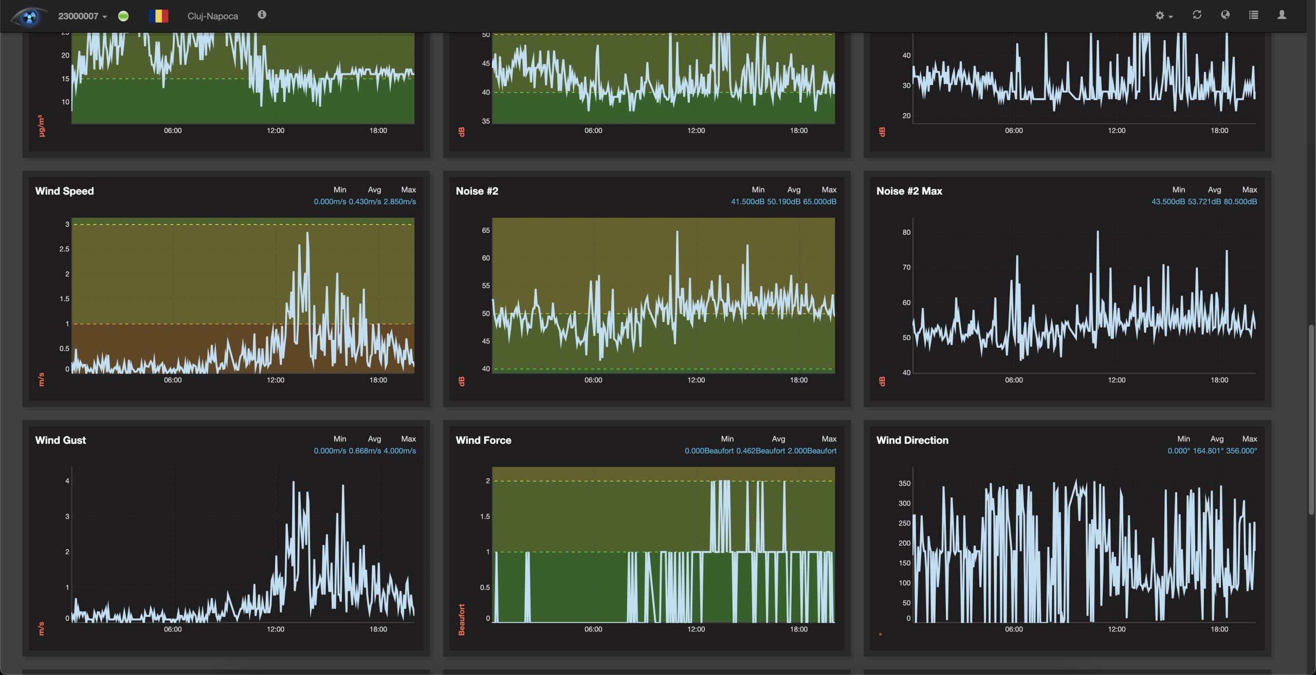
The Dashboard 09 is a complete rethinking of what a public environmental monitoring dashboard can be. The same uRADMonitor API now feeds six dedicated tabs per device:
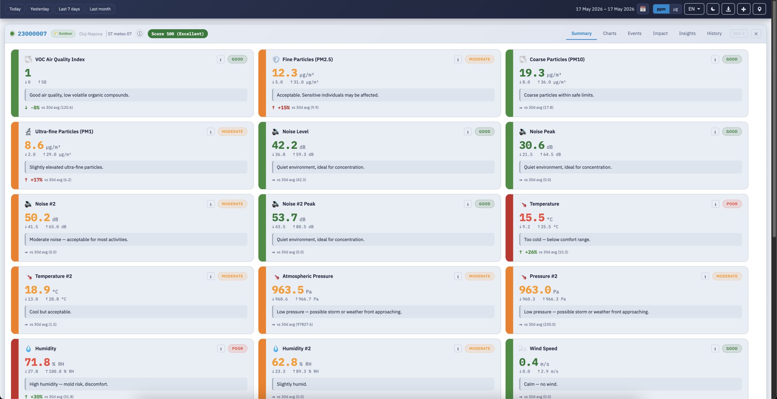
1. Summary of plain-language sensor cards with WHO-aligned colour coding;
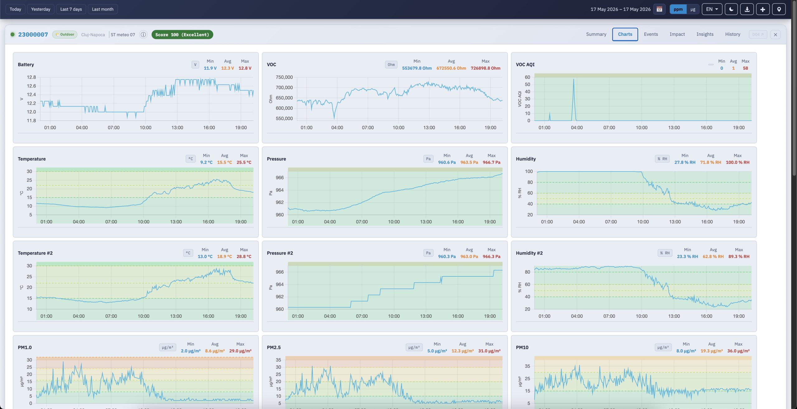
2. the familiar Charts view:
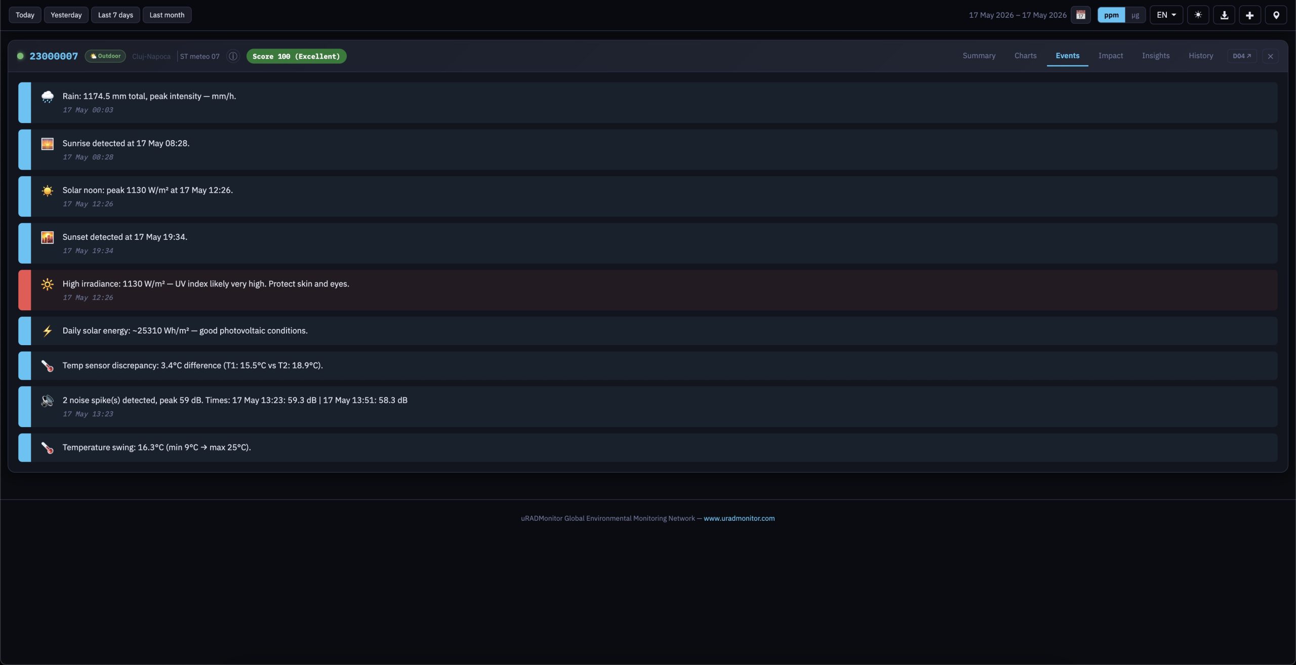
3. an Events tab that algorithmically surfaces noise spikes, PM2.5 episodes, CO₂ trends, and even sunrise/solar-noon/sunset moments from irradiance data;
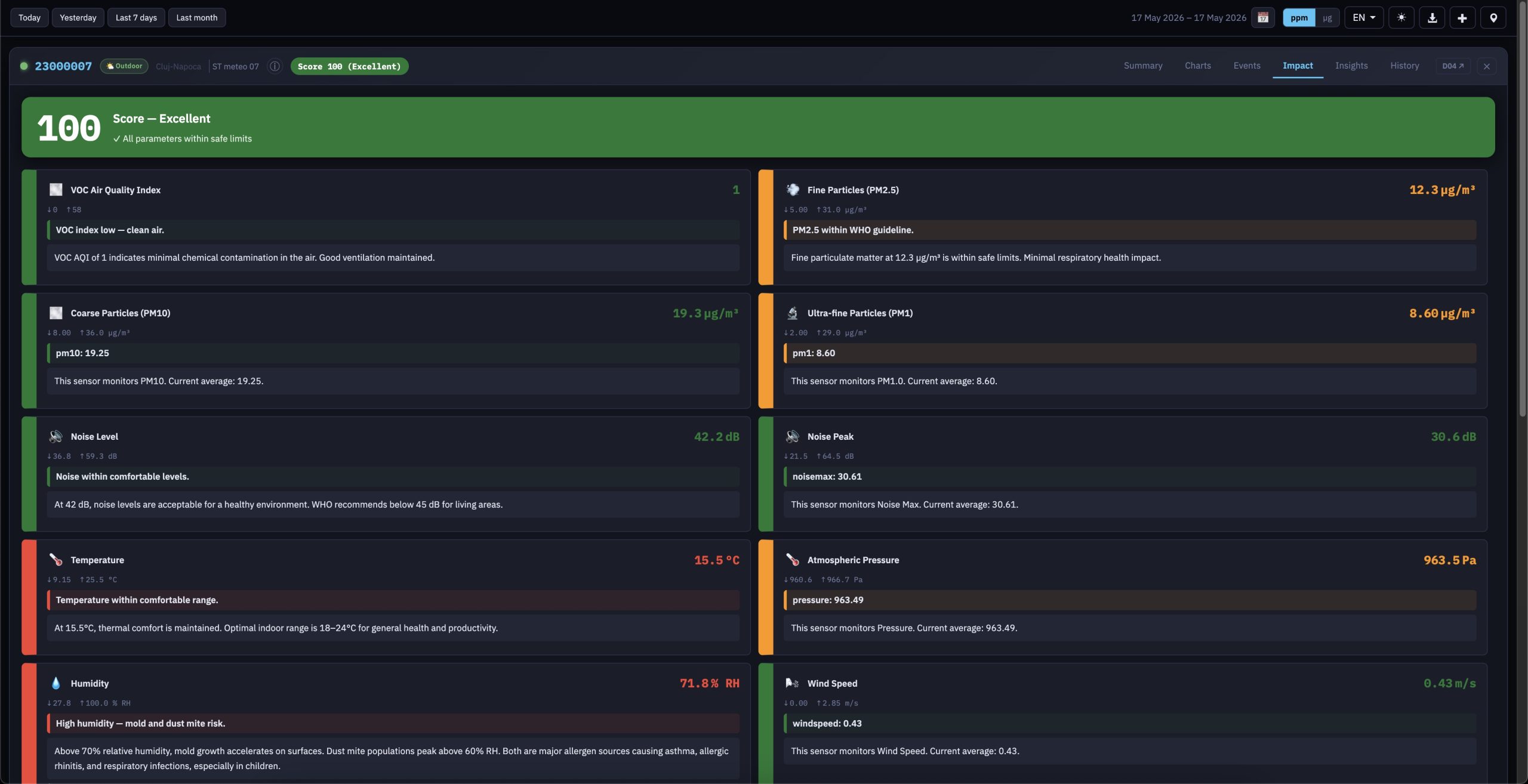
4. an Impact tab that pairs each measurement with a paragraph of health context and outdoor-vs-indoor recommendations;
5. an Insights tab that proposes meaningful sensor-pair correlations (ozone vs temperature for photochemical smog on CITY units, radon vs atmospheric pressure on seeRADON, ferrite-core temperature vs HV duty cycle on Model A radiation monitors);
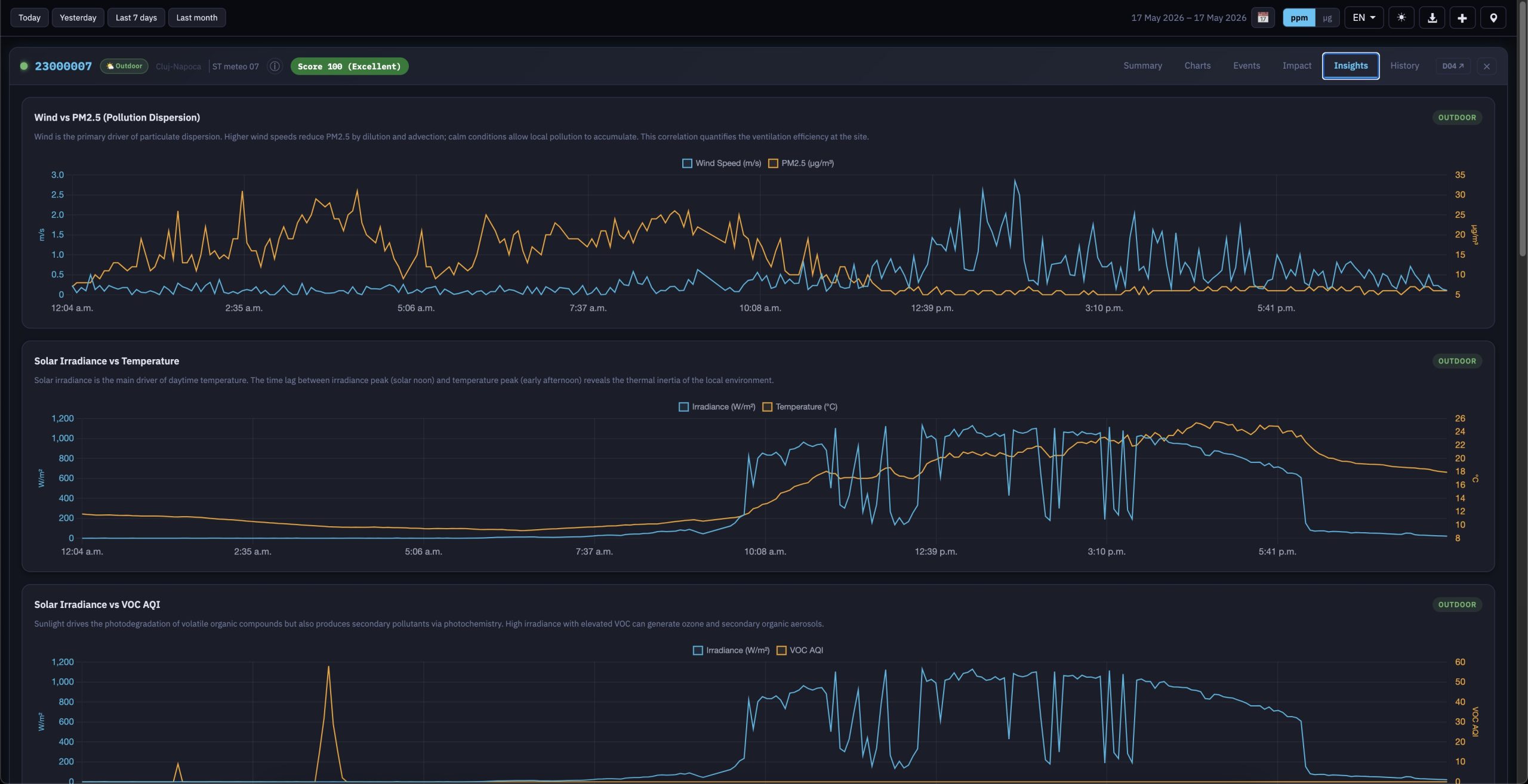
6. and a History tab that overlays an interactive monthly calendar with a synchronised score-trend chart , hovering over the chart highlights the corresponding day card below . This allows you to see changes and trends on a daily basis in one view, aggregating high volumes of data:
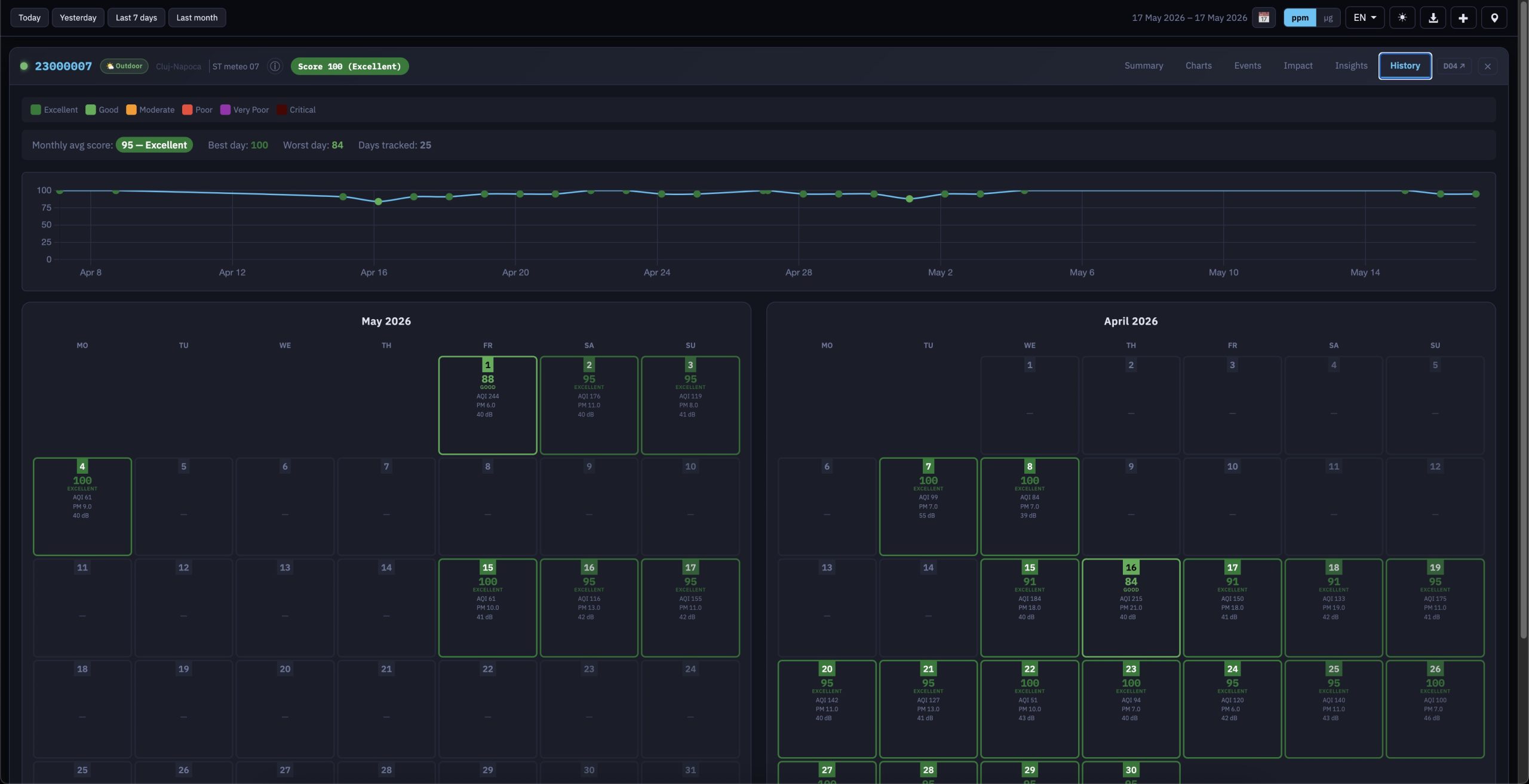
Behind the visible changes sits a new uradmonitor AQI scoring algorithm that distils all available sensors into a single 0–100 score across six colour-coded bands (Excellent → Critical), used consistently in titlebars, calendar cells and recommendations. The dashboard is fully model-aware , automatically presenting the right sensor set, gas labels and thresholds for the many uRADMonitor PRODUCTS: Model A, CITY, seeRADON, METEO, AQUA, INDUSTRIAL and Smoggie devices , and ships in six languages (EN/RO/DE/FR/ES/IT) with dark and light themes, a single consolidated toolbar that replaces the old double-bar navigation, intelligent tab disabling when no data is available for the selected interval, and a 4-month daily-averages API integration that powers the new History view. The result is a tool that doesn’t just show data , but it also explains it (yes, this was done because of popular demand).
We hope you’ll enjoy using these new features as much as we’ve enjoyed creating them for you.
Technical notes for developers
All URL parameters accepted by the new Frontend v7 can be set via PHP variables before require-ing lib/index.php, making it easy to embed with custom defaults. The full parameter list is in the documentation. Key ones:
?param=pm25        Selected parameter
?preset=24h        Time range (1h / 6h / 24h / 7d)
?overlay=idw       Overlay mode
?lat=45.7&lon=21.2&zoom=12    Map position
?open=DEVICEID     Open device on load
?lang=ro           Interface language
?theme=dark        Force dark theme
?ranking=0         Hide sensor ranking
All filter toggles (offline, indoor, anomalies, wind rose, etc.) are also URL-addressable.
Thank you to everyone who reported bugs, suggested features, and tested early builds. Your feedback shaped the new frontend, so keep it coming.
codemore code
~~~~