A new frontend update was recently deployed, following the 5.0 back in 2017. There were two major requirements for this change: one was to make the data access easier and the second, to improve the rendering on mobile devices. These new features were strongly requested by the community, but also by independent reviewers like Electronza. So we know how the updated started, but what exactly did we end up with? Here are the changes:
1. Data access has been improved:
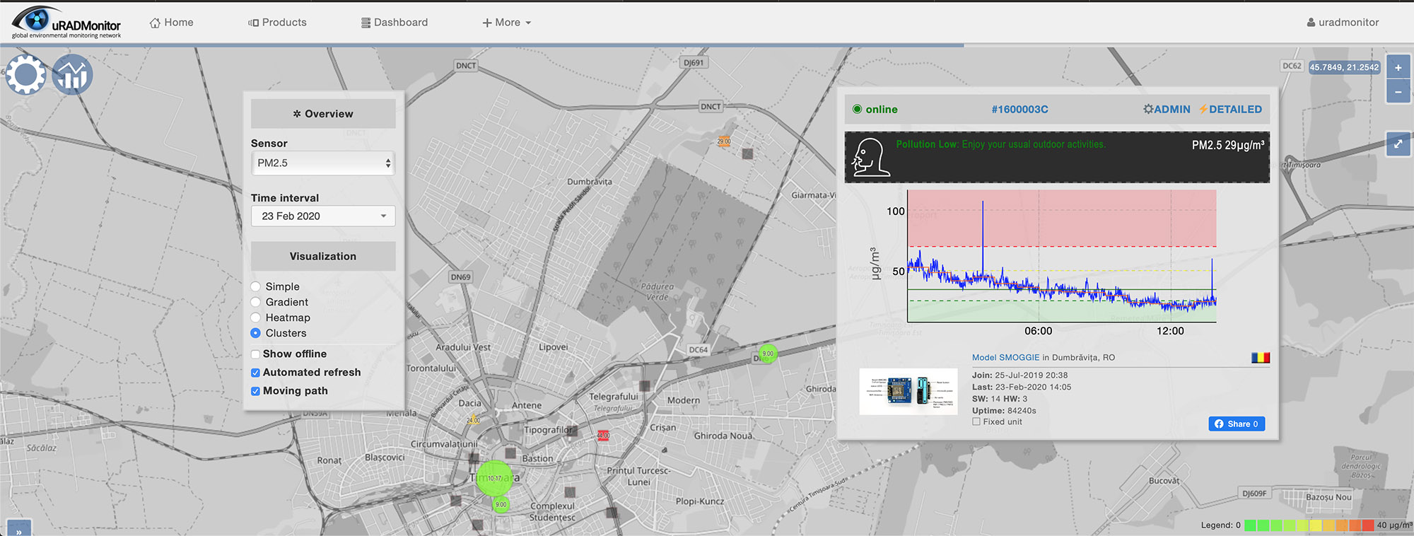
The site now loads a full screen map, with just a few buttons. The top left settings button (⚙) opens a popup where you can select the parameter you want to observe. By default it is PM2.5. There you can also select the time interval and map visualisation options. It starts with clustered view (close units will be joined in cluster and their colour will reflect the value and per the legend displayed at the bottom-right). Mobile units are selected by default and the “Moving path” option will load the last 24hours to show their trajectory.
The settings button (⚙) will stay visible at all time. When the settings popup is open you can drag it around to view the map better:

2. Zoom in on viewer’s location:
The server estimates the viewer’s location based on IP and loads the respective location to show nearby units of interest. If no units are in view, it offers a quick link to our shop, where the user can opt to buy a unit and cover more ground.
3.Default selected parameter is PM2.5
With Air Quality becoming a major concern all across the world, the frontend loads PM2.5 by default. You can change the parameter to view in Settings, by pressing the top-left button (⚙):

4.Detailed popup for any selected unit or cluster
Getting more data is as simple as clicking the unit you are interested in. If it’s a cluster you will get a popup with contained units to select the one you want. If you click a unit, it will open the history data and some additional stats. A new feature is the health message associated with some of the parameters . PM2.5 and PM10 will provide a health message giving you some advice on the things you can do or should not do based on the pollution level.

This popup window can also be dragged and dropped to make space on the map. You can dismiss the detailed view by toggling the second button that appears right next to the settings button or simply by clicking on a free location on the map.
5.Mobile devices friendly / responsive
Finally the uRADMonitor frontend works great on mobiles. All the things you do on a desktop, you can now do on a mobile device.

6. PM10 added to the list of parameters
Because more uRADMonitor devices support PM10, this parameter was added to the list and you can now see the PM10 pollution on the global map. You can directly call the parameter that you want using the “?sensor=<parameter>” variable. Here’s an example to load PM10 by default:
www.uradmonitor.com/?sensor=pm10
And for the other parameters:
www.uradmonitor.com/?sensor=temperature
www.uradmonitor.com/?sensor=cpm
www.uradmonitor.com/?sensor=co2
www.uradmonitor.com/?sensor=ch2o
7.Offline units disabled by default
Sadly some units go offline from time to time. Offline units kept on the map to offer a record on values registered in the past. In some cases this can be very useful. Previously, the clusters would include offline units in their average and colour representation, resulting in some confusion. This is why we disabled the offline units and they will no show unless you enable this option in the settings panel.
Thanks for your feedback!
As you can see, many of your great ideas are integrated. So, keep the feedback coming, we’d love to make this tool serve you best.
I like new new interface, it’s much easier to browse around and having the detail view more accessible is handy. Plus Dave@EevBlog has his units back online now, so there are extra data points in my area 🙂
Thanks Moz! Any features you’d like to see added ? Just let me know.
Hi Radu,
This is is Jonathan Kim form Hana Enterprise Korea. My company is a Trading company doing many things for IoT solutions.
I have much interest in your Model A3, Model Industrial and Smoggie PM.
Could you please send me information on the above products with your company introduction together with your contact information?
Regards
Sales & Marketing Director / HANA Enterprise Co., Ltd.
Address: 2F, 16, Cheongmyeong-ro, Yeongtong-gu, Suwon-si, Gyeonggi-do, Republic of Korea 16710
Mobile: 82-10-9661-7813 / Tel.: 82-31-204-3505
E-mail: jonathan@hanaenterprise.com
Greetings,
Actually favored the old map format. Is it possible to list all the URL parameters not just for sensor? Would like to create a go-to URL shortcut that shows GRADIENT, INDOOR and if possible a GLOBAL and USA map.
OR some way to configure the map in settings and save as a URL.
Also, The IP geo-location for my location is grossly off.
I check on this almost daily and have to change settings every time.
Thanks,
Greg