For years, the uRADMonitor network has been quietly doing what no single sensor can: covering the planet with a continuous, real-time picture of radiation, air quality and toxic gas concentrations. What it lacked was a way to tell you, the user behind the screen, immediately, when something you care about crossed a line you drew yourself. That changes today.
Threshold alerts are now available for every uRADMonitor account. You set the parameter, the direction and the value. We deliver the notification.
The dashboard that holds all of this has been rebuilt at the same time. It now shares the visual style of the live map, supports the dark and light themes you already use across the site, and handles large accounts with many sensors without turning into an endless scroll. Both changes shipped together, and the second exists because of the first: alerts are only useful if configuring them takes seconds.
What you can alert on
Every parameter your device measures can trigger an alert. Radiation dose rate, particulate matter at any size fraction, ozone, formaldehyde, carbon dioxide, carbon monoxide, nitrogen dioxide, sulphur dioxide, hydrogen sulphide, VOC index, oxygen concentration, temperature, pressure, humidity. If the sensor reports it, you can set a threshold on it.
Two directions are supported: above a value, and below a value. You can set both on the same parameter, which allows things like “alert when PM2.5 exceeds 50 µg/m³, and again when it falls back below 15.” All rules are independent.
Instant delivery, without being invasive
Threshold alerts are evaluated on every single sensor reading as it arrives at the server, not on a scheduled scan. The moment a value crosses your limit, an alert event is queued. A delivery process runs every five minutes and sends what is in the queue.
In practice, for a sensor uploading every 60 seconds, you will receive the notification within five minutes of the crossing. For radiation and gas sensors where a transient spike matters as much as a sustained level, this realtime delivery is the reason inline evaluation was chosen over a periodic scan.
At the same time, the system is designed not to flood your inbox. Each rule carries a cooldown period, defaulting to six hours. Once an alert fires, it will not fire again for the same rule until the cooldown expires, even if the condition holds continuously. A PM2.5 value stuck at 200 µg/m³ all day produces one notification in the morning and at most three or four more through the day, not one every ten minutes. Alerts are combined so if several get in the queue, you will get one single email, mentioning all.
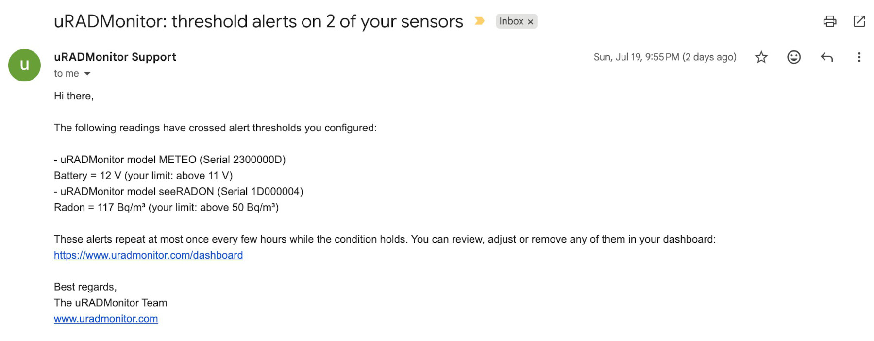
If the condition clears and returns, the cooldown resets on the next crossing. The logic is straightforward: you get told when something happens, and reminded periodically while it persists, but the channel stays clear enough to be worth paying attention to.
The dashboard, rebuilt
Everything below now lives in a redesigned interface. The old dashboard was built on wide HTML tables: thirteen columns per device, every field always visible, one row per unit stacked vertically. It worked when accounts held two or three sensors and hardly on small screens.
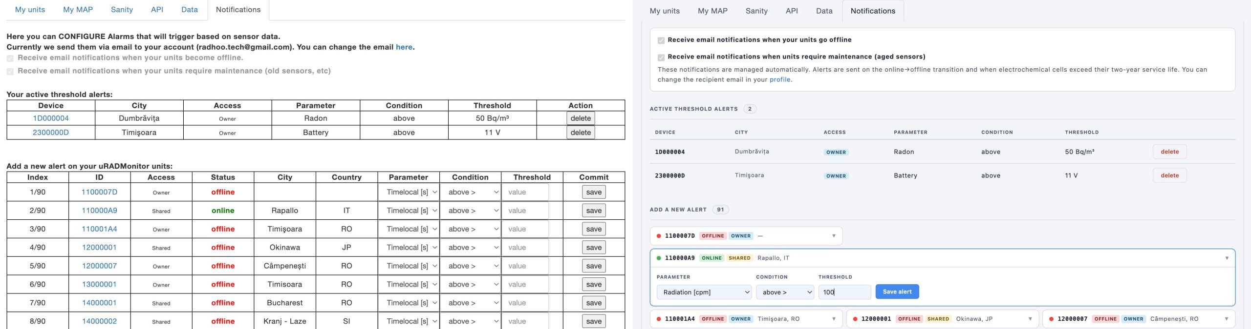
One visual language across the site
The dashboard now uses the same design system as the live sensor map: the same palette, the same typography, the same card and badge shapes. Numeric values and device identifiers are set in a monospaced face so columns of readings line up and serials stay easy to compare at a glance.
The dark and light themes follow the toggle in the navigation bar. Switch it once and every panel follows immediately, including tables, form fields, buttons and the page background itself.
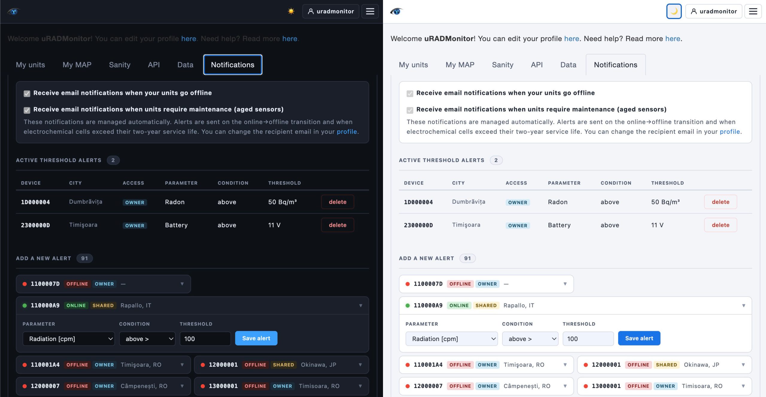
Cards instead of rows
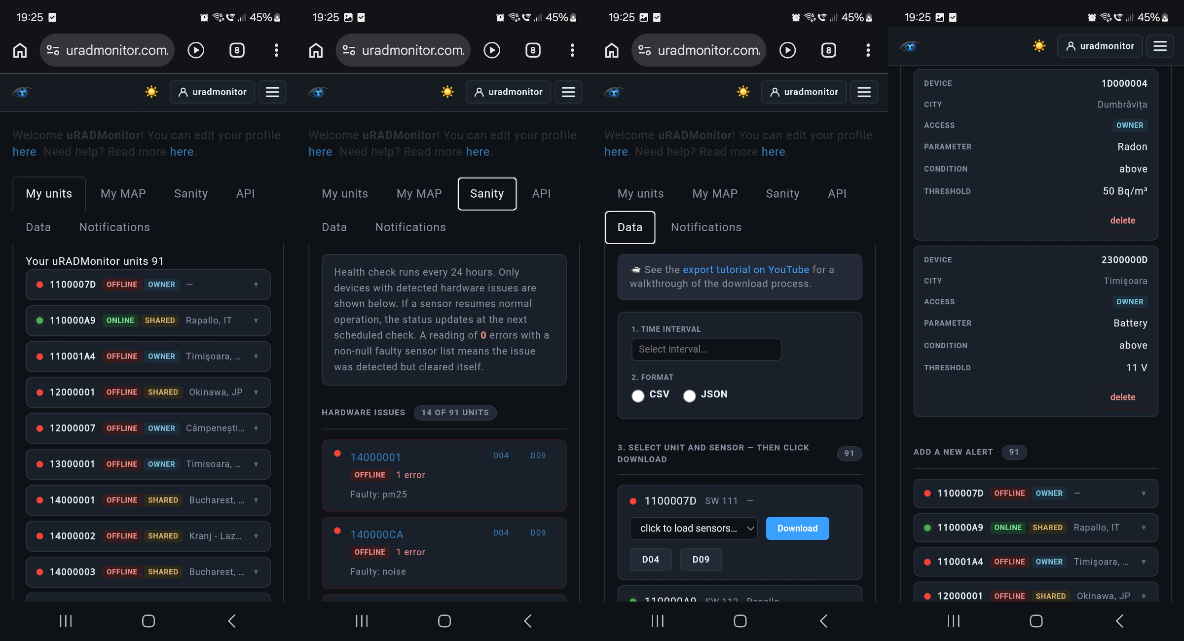
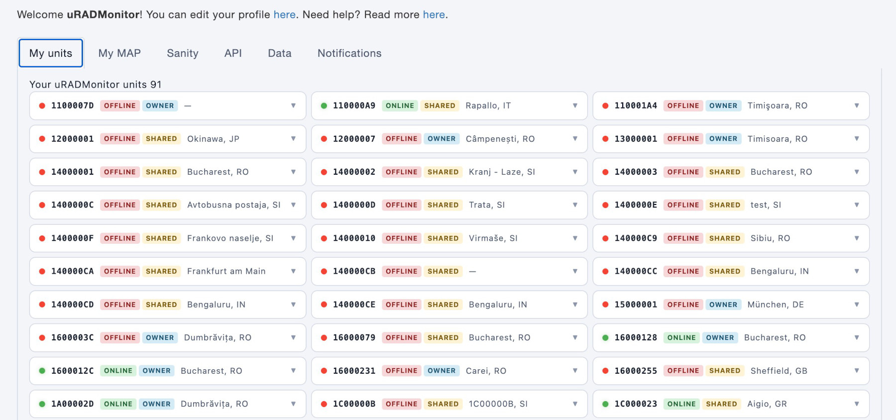
Each device is a card. Collapsed, it shows what you need to scan a fleet quickly: a coloured status dot, the serial, whether the unit is online, whether you own it or hold shared access, and its location. Click it and the card expands into the full editing form, taking the whole row so the fields have room to breathe.
On a wide screen the cards sit three across, two on a tablet, one on a phone. An account with ninety sensors now fits in a fraction of the vertical space it used to need.
My units
A grid card structure described above, plus the panel that detects uRADMonitor hardware on your network and offers to add it to your account with one click.
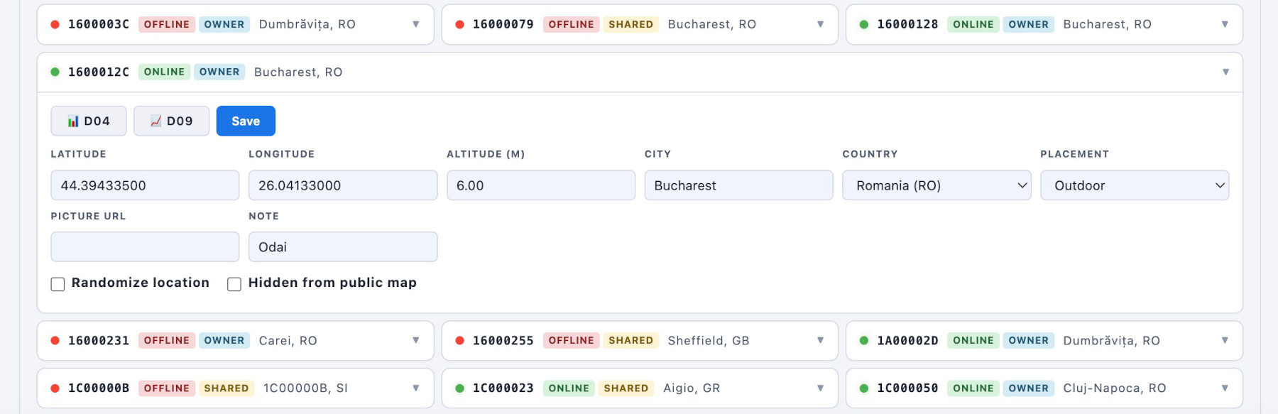
Two shortcuts sit at the top of every expanded card: D04 opens the classic device dashboard, D09 opens the newer one implemented with the Frontend v7 announced a while ago. Both in a new tab, both preserving whatever you were doing. Randomize location and Hidden checkboxes are the same as before, explained here.
Add to my account
When a device uploads data, the server records the public IP the upload came from. If you open the dashboard from the same network as your sensor, your browser’s public IP matches that recorded IP, so the server can list the device as “available at your location” and offer the Add button.
Clicking it assigns ownership of that device to your account, which is what unlocks the configuration fields: coordinates, city, placement, the hidden and randomise flags. The IP match is the proof of physical proximity, since only someone actually on that network could produce it.
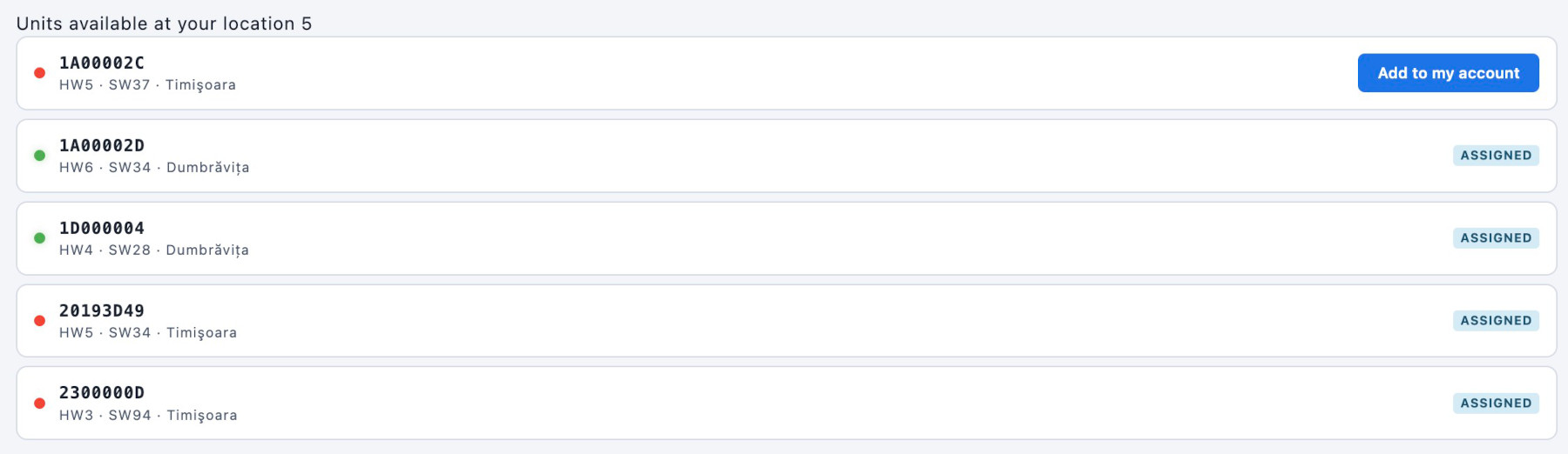
Two practical consequences: the sensor and the computer must be behind the same router, and a device that already belongs to another account is refused rather than transferred.
My MAP
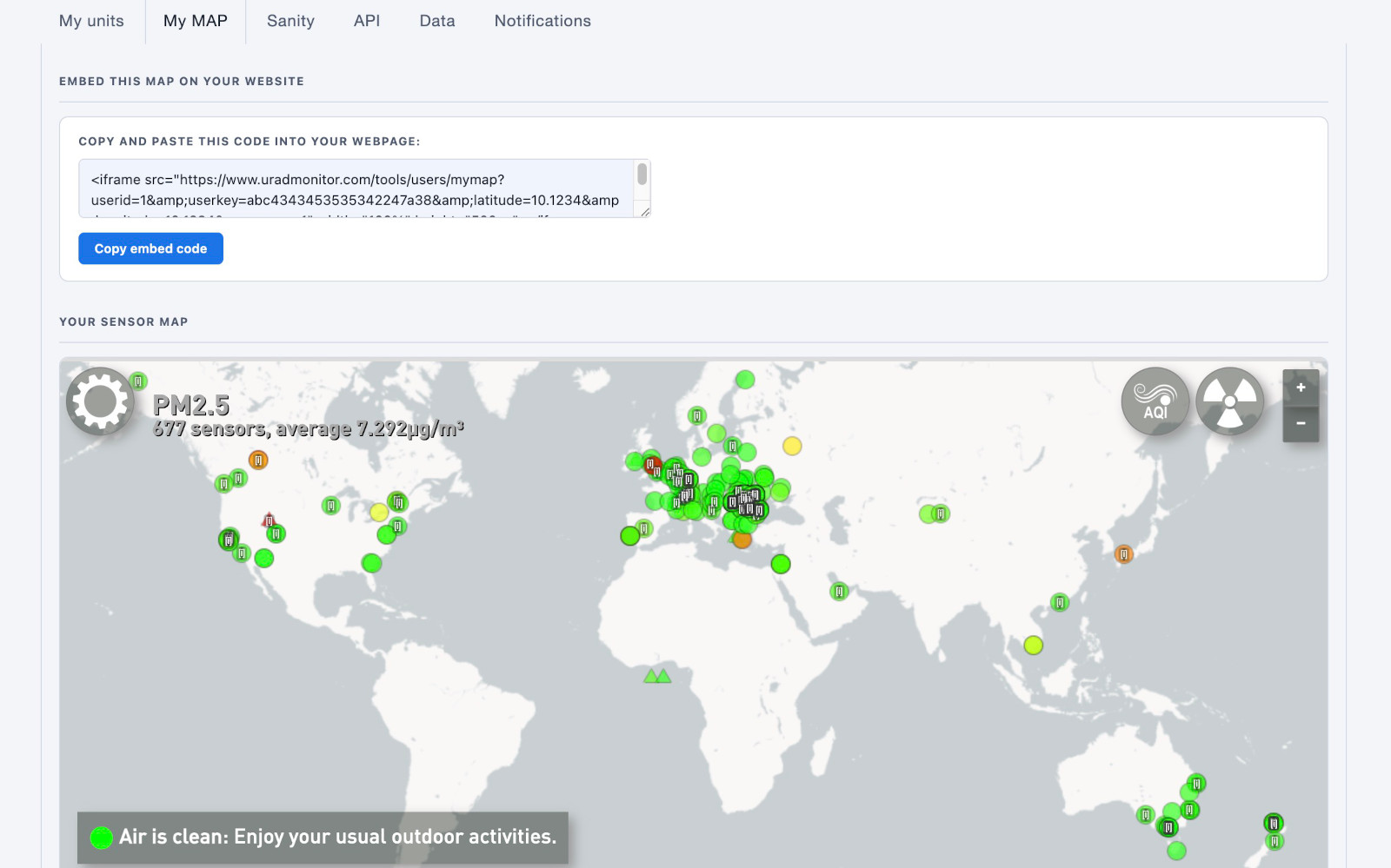
Here is your personal sensor map, with the embed code ready to copy into your own site. This is offered as a quick way to integrate your sensors into an existing website: you just copy/paste a few lines of code, and that’s it, you can have a nice GIS implementation straight in your own webpage or project. No need to worry about implementing all the uRADMonitor API yourself, we do this for you.
Sanity
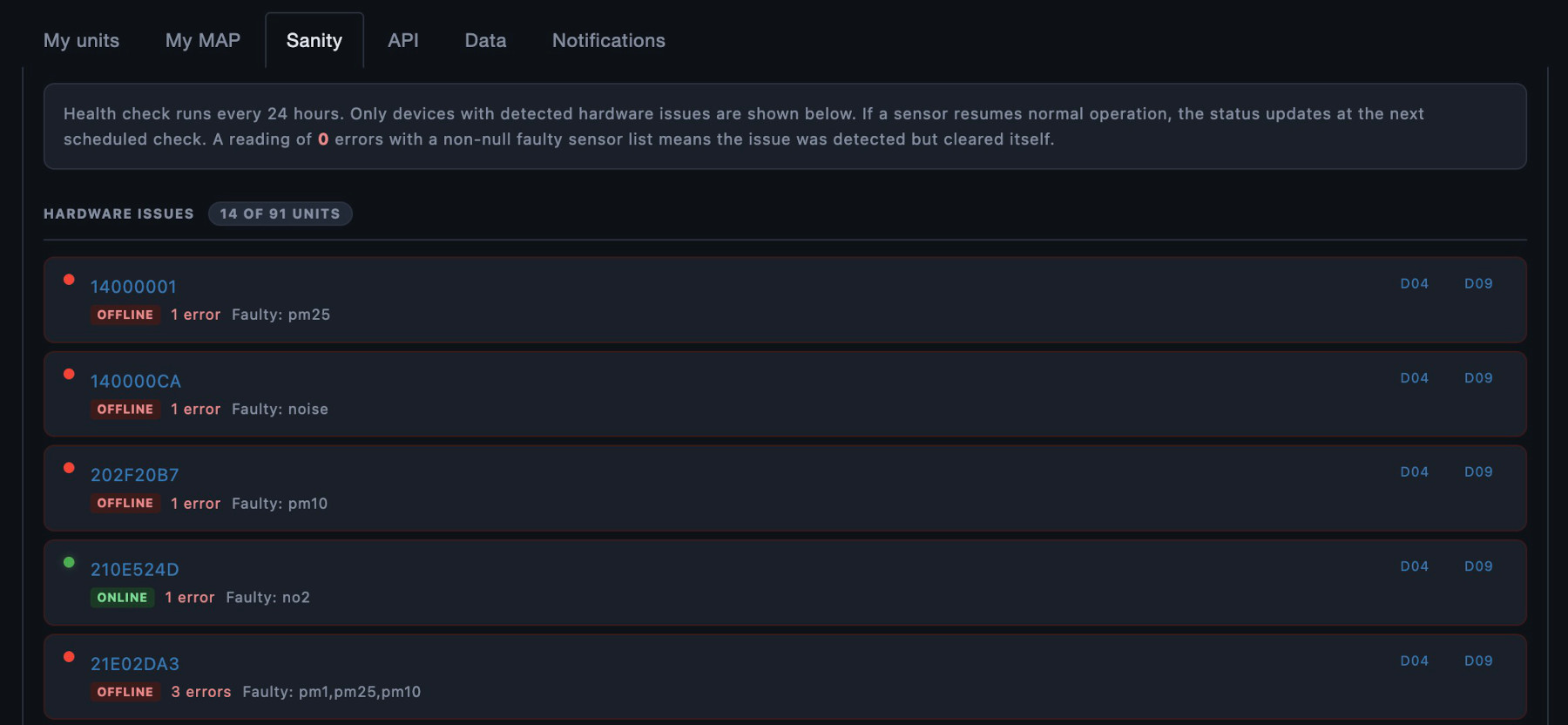
This sections shows the automated health check. Only devices with detected hardware faults are listed, each showing the error count and the specific sensors involved. When nothing is wrong, the panel says so plainly instead of showing an empty table.
API
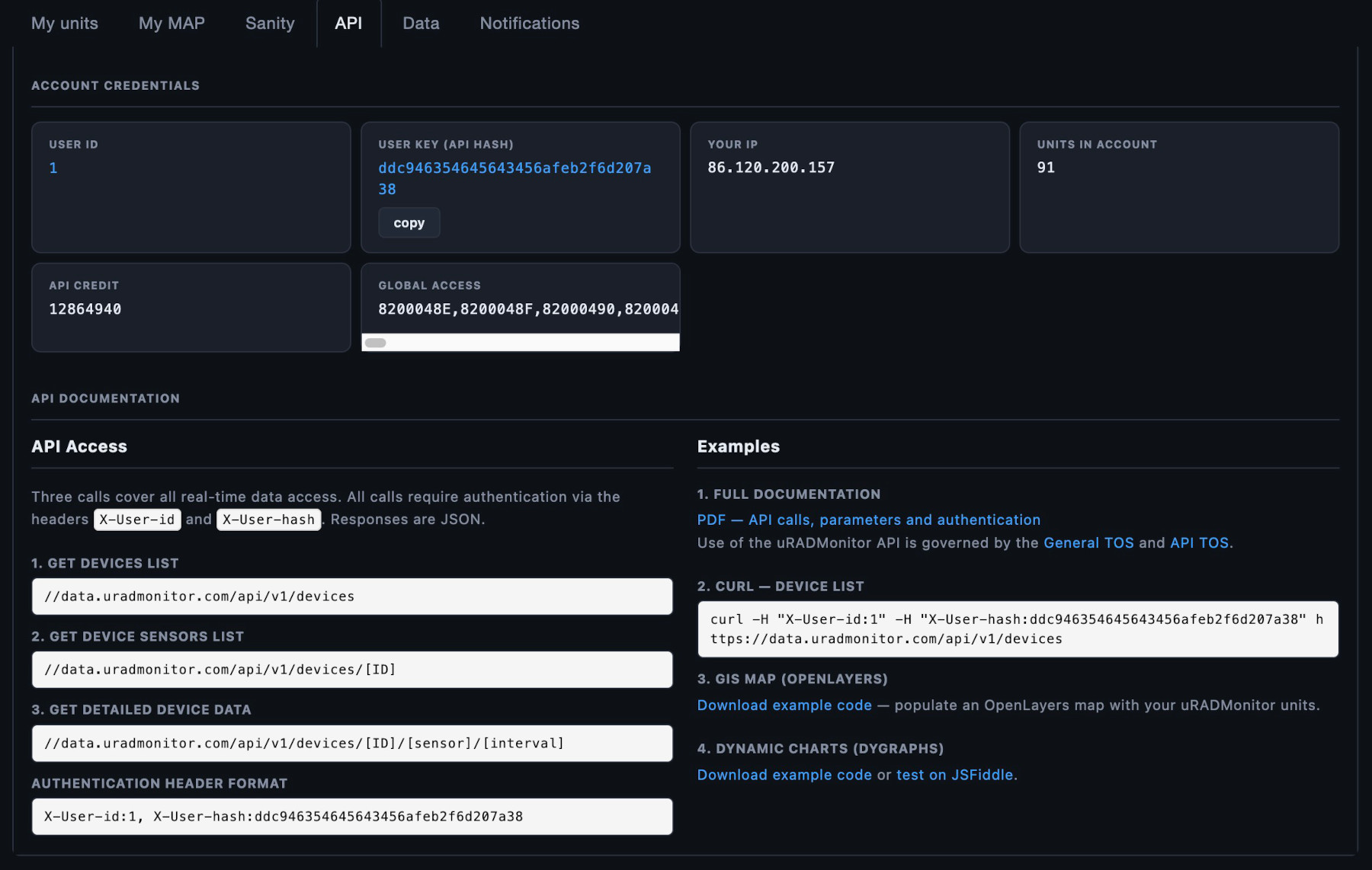
Your credentials in individual cards with a copy button, and the documentation reorganised into two readable columns with working examples. Code samples to get you started using the uRADMonitor API in your applications.
Data
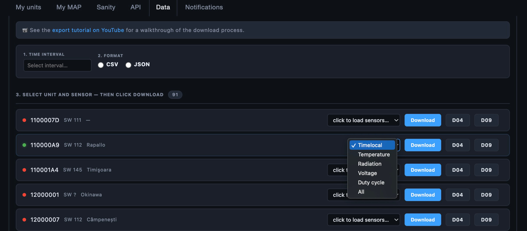
CSV and JSON export. Pick an interval, pick a format, pick a sensor, download. Note that when selecting “All” , you can only download an interval of 24 hours of data. For one individual parameter, a maximum of one month is allowed.
Notifications
This is the new section where you can add alerts to be notified in real time. See more below.
Usable on a phone
The old dashboard needed a desktop. Thirteen-column tables do not survive a 420px screen, and the parts that did fit needed horizontal scrolling to reach the save button. Doable, but not convenient. Now every panel reflows. Cards drop from three columns to two to one. Editing forms stack their fields instead of squeezing them. The alert rules table turns into one card per rule below 700px, with each value labelled, so nothing is hidden behind a scrollbar. Long device names, cities and part numbers wrap rather than pushing the layout sideways.
The shop, too
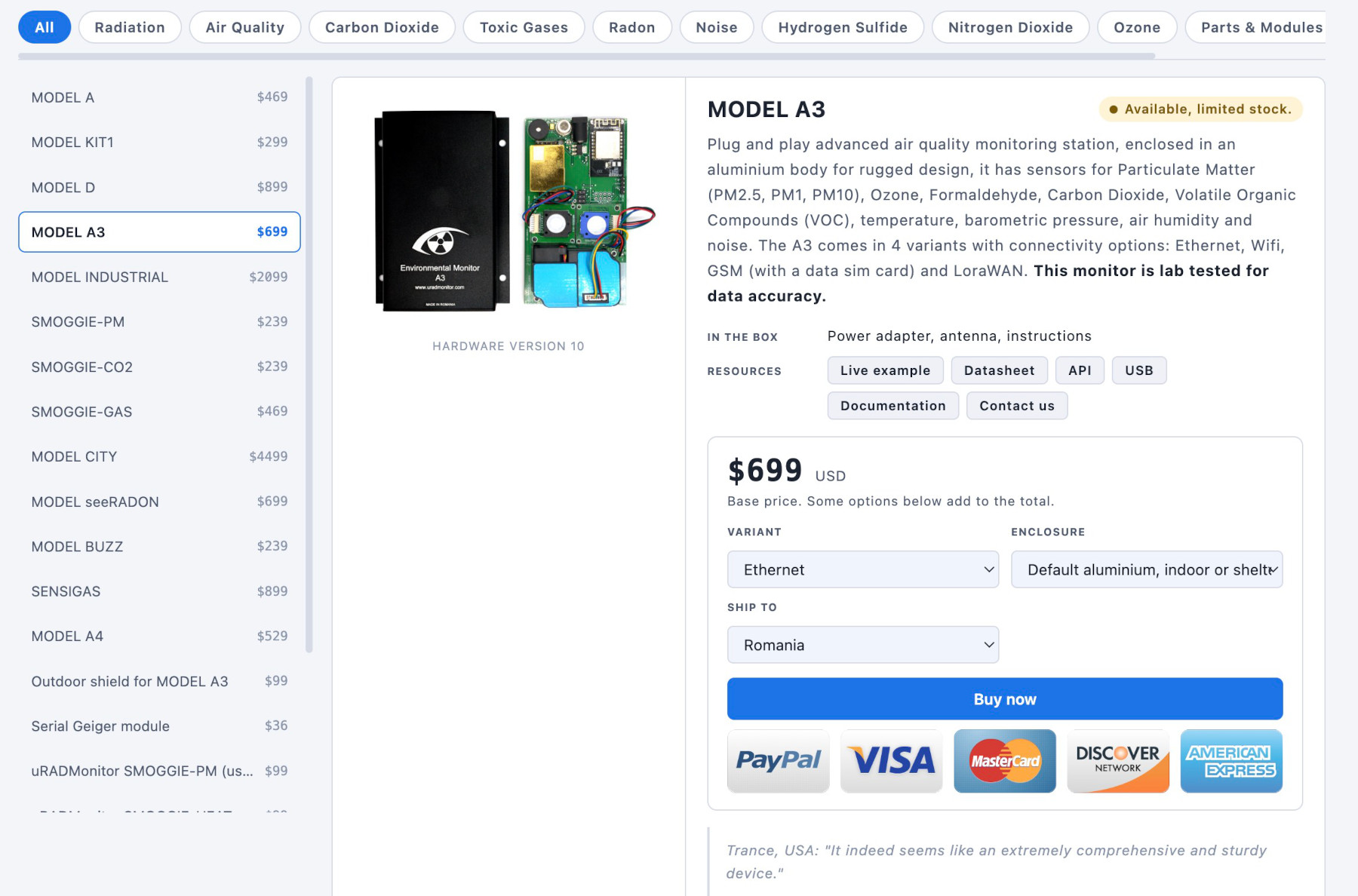
The product pages received the same improvements: identical palette, identical dark and light behaviour, a category filter you can swipe, and a layout that stacks cleanly on a phone. The catalogue behind it was optimised, which means prices, stock and descriptions can be corrected without a deployment.
Products with more than one photo now show thumbnails under the main image, so an enclosure can be seen next to the board it holds. Spare parts and modules appear in the default listing rather than only inside their own category, which is where several people had failed to find them.
One practical addition: every product’s documentation section is now directly linkable. A URL of the form /products/?sel=4#docs-4 opens the right product with the right tab already showing, which makes it far easier to point somebody at a specific installation note or sensor table in an email.
Faster on large accounts
The old dashboard requested the sensor list for every device the moment a tab opened. On an account with ninety units that meant ninety API calls before you had clicked anything, which was enough to exhaust an hourly quota in uRADMonitor Shield, simply by looking at the page. Sensor lists are now fetched only for the device you actually interact with, once, and cached for the rest of the session.
Managing your own alert rules no longer counts against the API quota at all. Reading and editing them is account administration, not data consumption, and it is now exempt. The results? More resources freed to serve a better purpose.
Notifications: configuring your alerts
Open the dashboard and navigate to the Notifications panel.
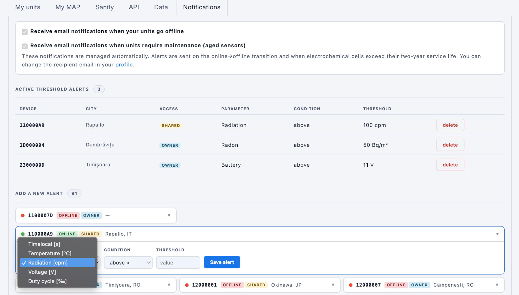
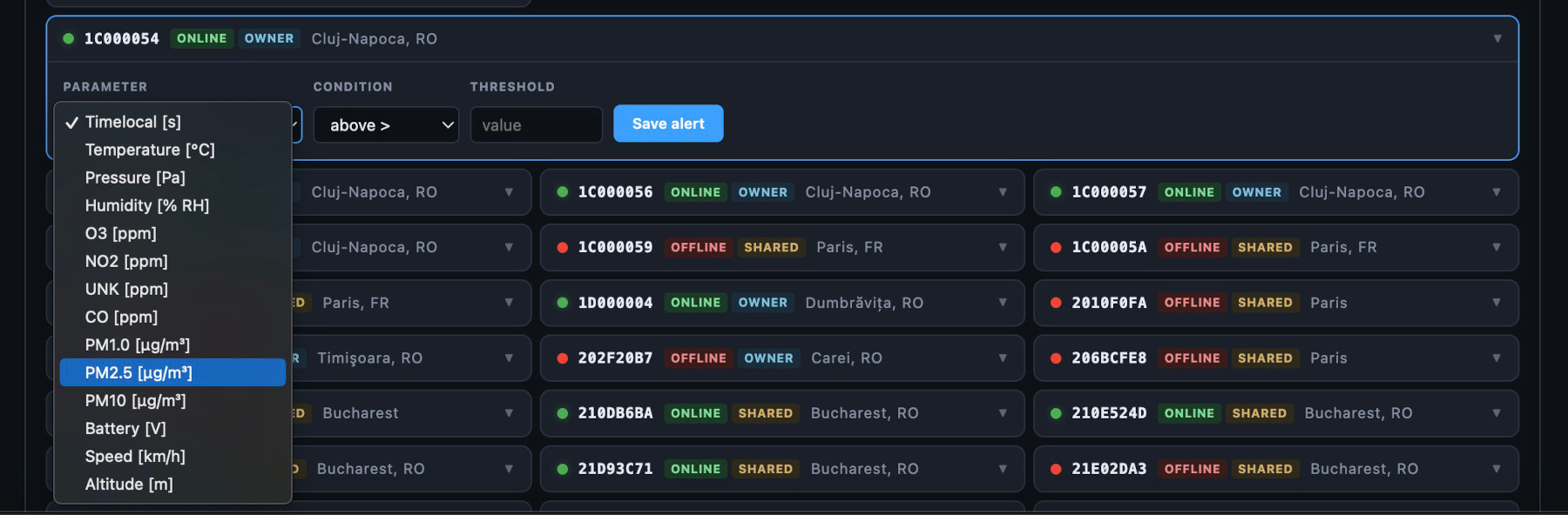
You will see two sections. The top table lists your active rules: device, city, parameter, condition, threshold value, and a delete button for each. The bottom section shows every device in your account and lets you define a new rule: pick the parameter from the dropdown, choose above or below, enter the value, and press save.
That is the entire process. No confirmation screens, no waiting for a page reload. The rule is live immediately. Note that you can set rules both to your devices, and on those you have shared access to.
To remove an alert that is no longer useful, or that is triggering more often than you want, press delete on its row. It is gone. The system has no other mechanism for silencing an alert: there is no mute, no snooze, no unsubscribe flow. The design choice is deliberate. An alert you no longer want should not exist.
Owner and shared access
The uRADMonitor permission model distinguishes two roles: owner and shared.
The owner is the account that claimed the device, pretty much the person who purchased the sensor. Owners can change the device configuration: location, name, city, placement, hidden and randomise flags. Shared access means another account has been granted visibility to the device, but cannot change its configuration.
Both owners and shared users can set threshold alerts. This is intentional. A municipality that has deployed a fleet of MODEL CITY units may grant shared access to a third-party monitoring service or to a research institution. Those accounts need to be able to define their own alert thresholds without needing the keys to the device configuration.
Alerts are personal: they belong to the account that created them, not to the device. Two users can have different thresholds on the same device and each receives their own notifications. Deleting a device does not delete another user’s alert rules for it; they simply stop firing because the device no longer reports.
In the dashboard, the device list shows whether each entry is Owner or Shared, so it is always clear what you can and cannot change.
Five scenarios where this matters
1. Radiological contamination event
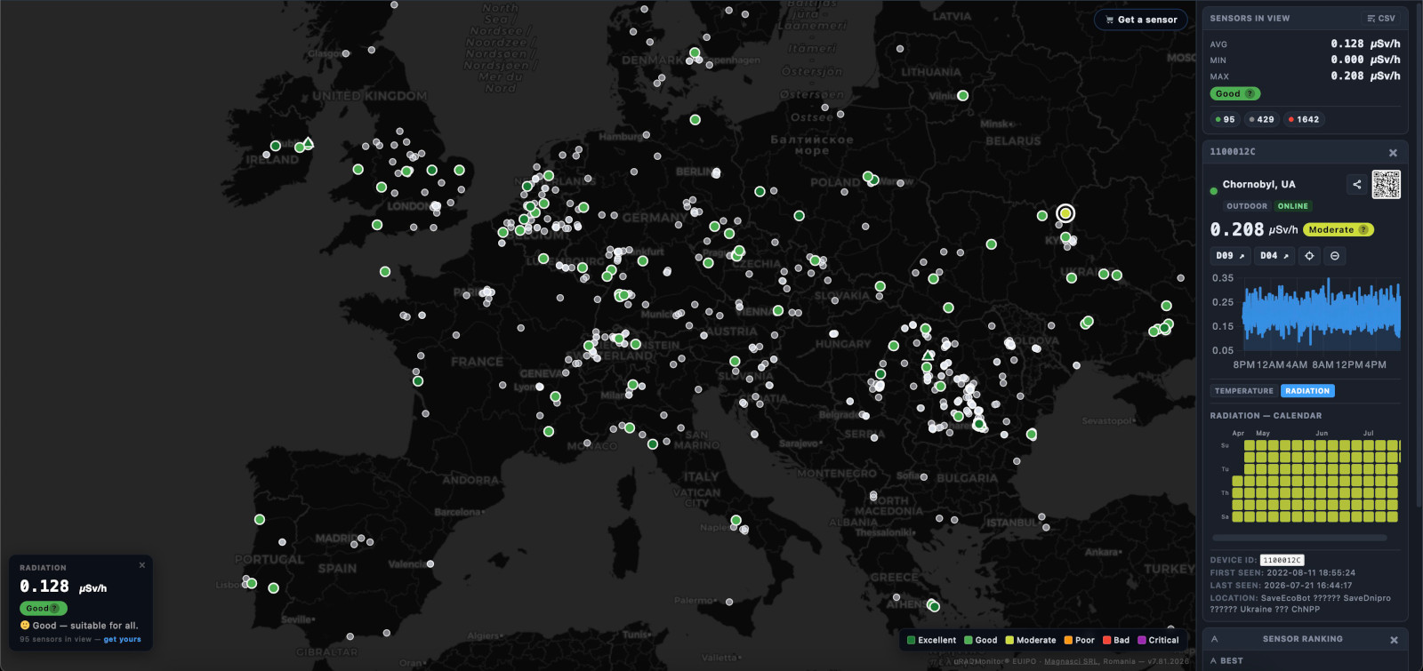
You have a uRADMonitor Model A or Model A3 (hardware version 5 or earlier, which includes the Geiger counter) at a location near a nuclear facility, a transport route or a research site.
Set: Radiation (dose rate) above 0.30 µSv/h
The natural background at most European locations is between 0.05 and 0.20 µSv/h. A value above 0.30 µSv/h is unusual and merits attention. At 1.00 µSv/h the situation is serious. At 10 µSv/h the area is in an emergency.
The scenario: an incident at a nearby facility releases radioactive material. Your sensor registers 0.45 µSv/h at 03:14. Within ten minutes you receive a notification with the exact reading and your configured limit. You have the information before any official announcement.
The cooldown means you will not receive a duplicate at 03:24 if the value is still elevated; you will receive a follow-up six hours later if it has not resolved. Every reading is still being recorded and is visible in your dashboard chart for post-event analysis.
2. Urban smog: arrival and clearance
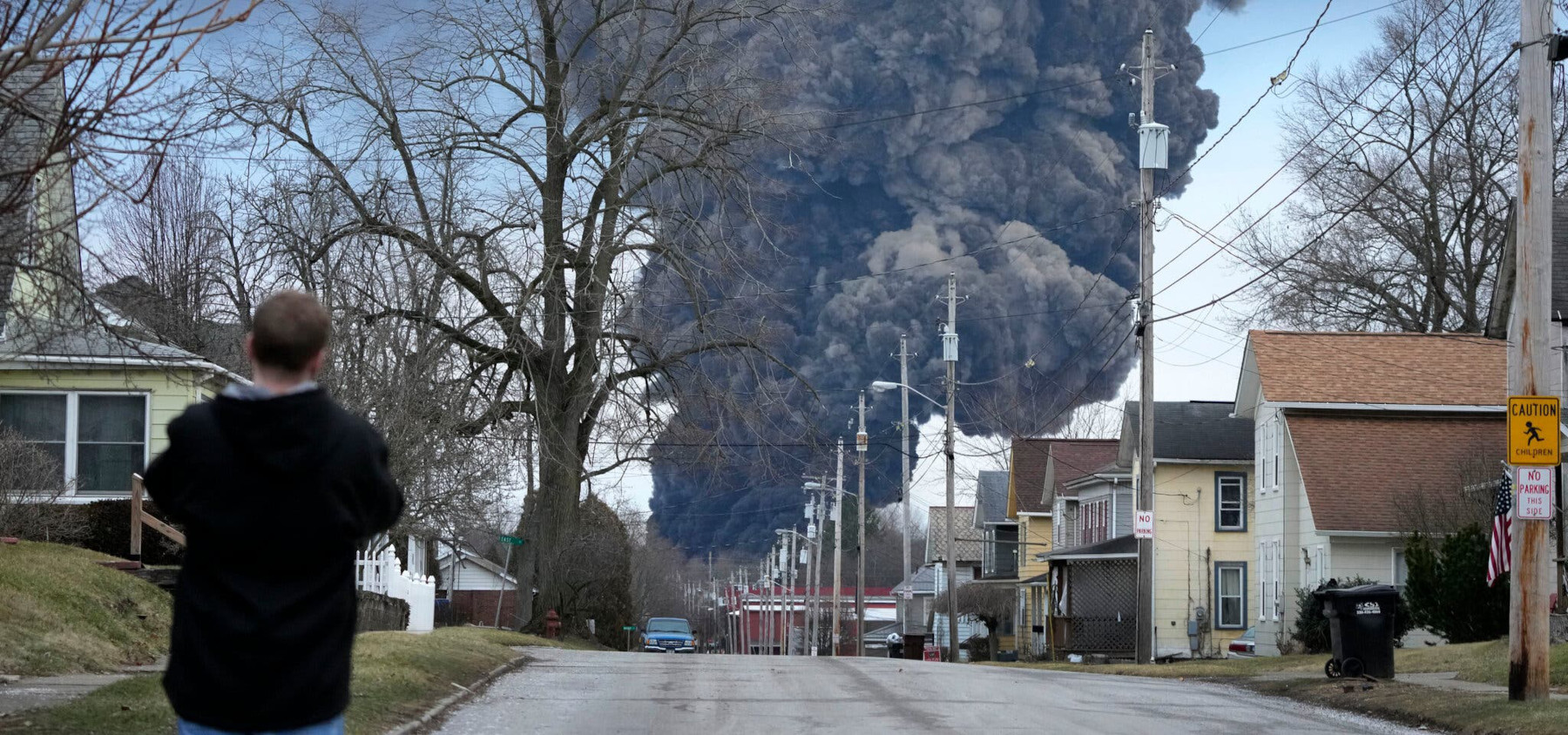
You have one or more SMOGGIE-PM or MODEL CITY units in an urban area. Winter inversions and traffic combine to push particulate matter to unhealthy levels for hours or days at a time.
Set two rules:
- PM2.5 above 50 µg/m³ : the WHO 24-hour guidance value, triggering when air quality becomes unhealthy
- PM2.5 below 15 µg/m³ : the clearance threshold, confirming when the episode has passed and its safe to go out
The scenario: a high-pressure system settles over the city on a cold evening. By 22:00, PM2.5 has reached 67 µg/m³. You receive the first alert. Overnight, values peak at 140 µg/m³. The six-hour cooldown means a second reminder arrives at 04:00, still elevated. By 10:30 the following morning, a weather change clears the air. PM2.5 drops to 12 µg/m³. The clearance rule fires and you receive a second notification: the episode is over.
Two notifications from one device tell you the full story: when it started and when it ended. For parents of children with asthma, city administrators, or a school deciding whether to cancel outdoor activities, that second notification is as important as the first.
3. CO₂ rise in an occupied space
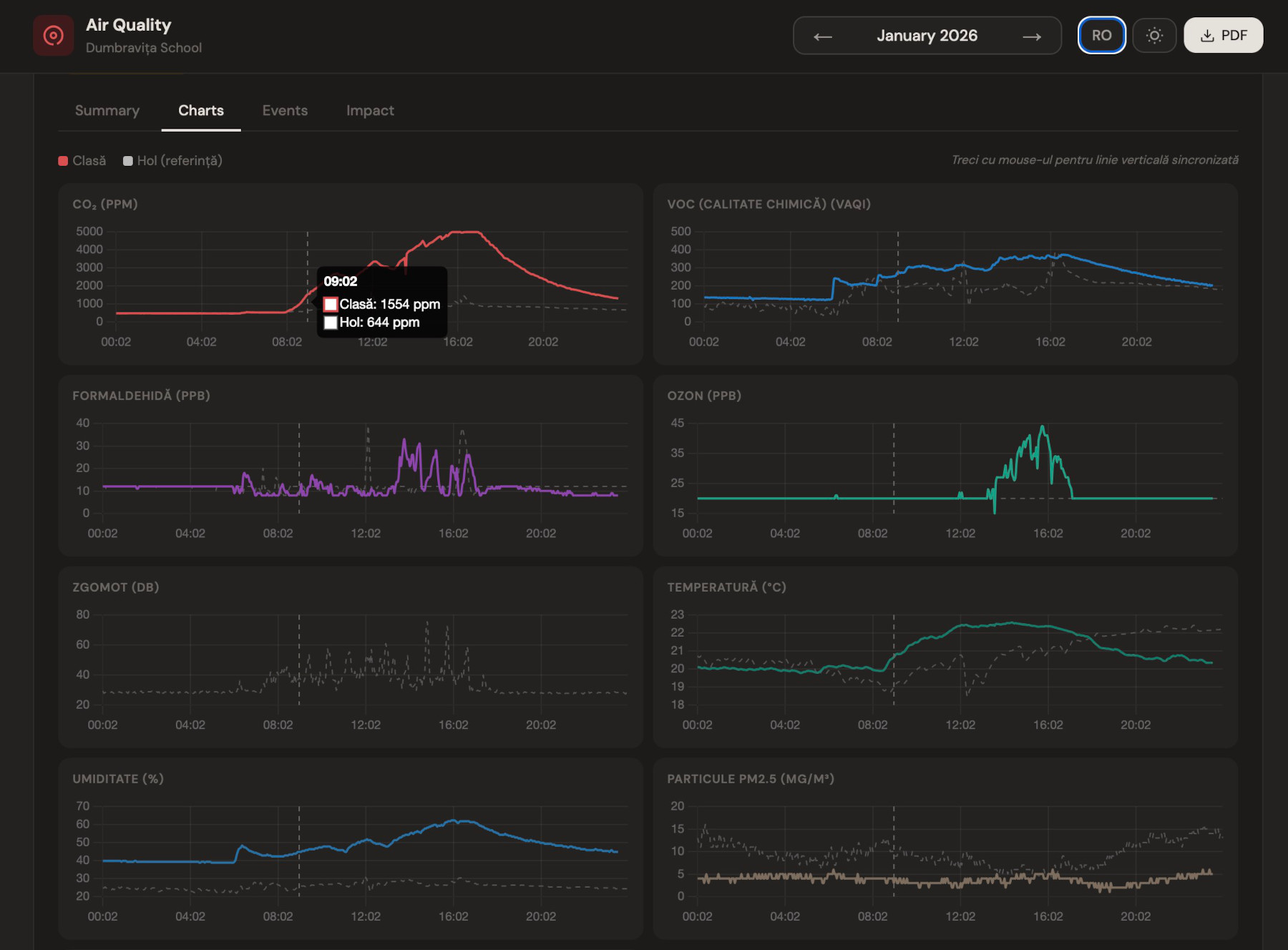
A uRADMonitor MODEL A3 is mounted in a classroom, a meeting room or a shared office. Carbon dioxide accumulates when ventilation is inadequate, causing the well-documented cognitive impairment that makes people in badly ventilated rooms feel vague and tired without understanding why.
Set: CO₂ above 1000 ppm
Outdoor air is approximately 420 ppm. A well ventilated room stays below 800 ppm. Above 1000 ppm, occupants begin experiencing measurable reductions in cognitive performance. Above 1500 ppm, the effect is significant. The CO₂ sensor on the MODEL A3 uses an optical NDIR principle, meaning it does not wear out like an electrochemical cell and remains accurate for years.
The scenario: a meeting of twelve people fills the room at 09:00. By 09:40, CO₂ has climbed to 1050 ppm. An alert arrives on the room administrator’s phone. A window is opened. By 10:10, CO₂ is back at 750 ppm.
The practical value here is not dramatic but it is cumulative: a school that monitors CO₂ and acts on it produces measurably better learning conditions. A workplace that does the same reduces afternoon productivity loss. The alert is the mechanism that converts measurement into action.
4. VOC spike from industrial emissions
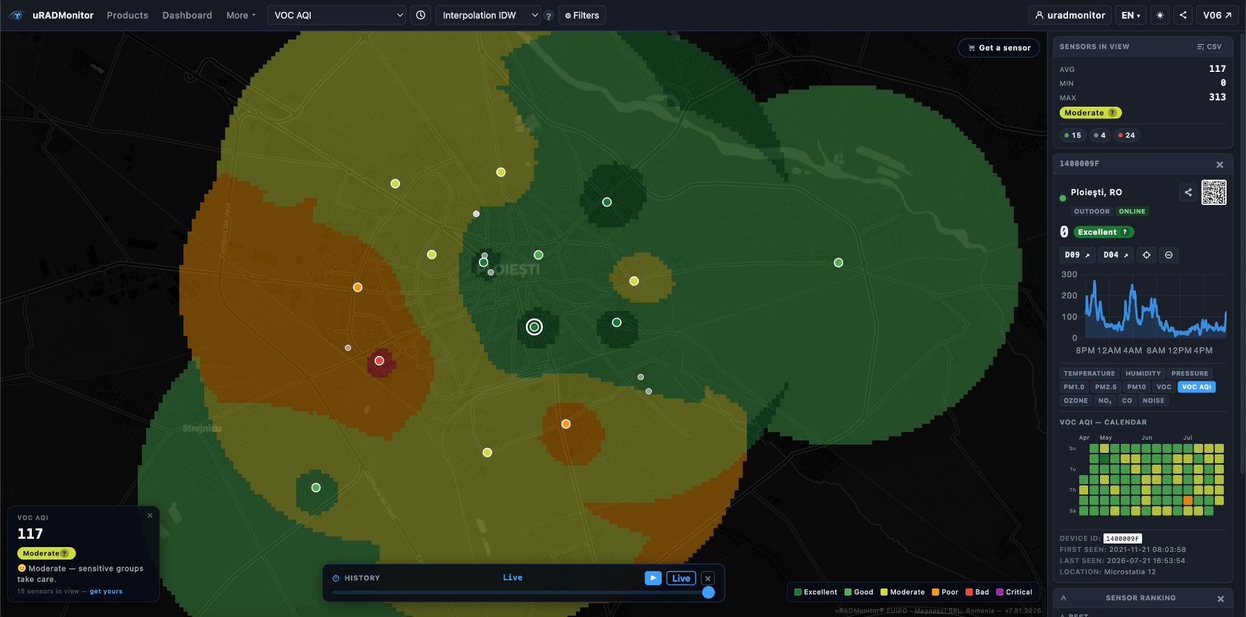
A MODEL INDUSTRIAL or MODEL A3 unit is positioned downwind of an industrial facility, a printing house, a paint shop or a wood processing plant. The VOC sensor measures the aggregate concentration of volatile organic compounds, which include a range of substances emitted during production, solvent use and combustion.
Set: VOC above 200 µg/m³ (or the equivalent index value for your sensor)
The scenario: a batch process starts at the facility at 14:00. Wind shifts to carry the plume across your monitoring point. VOC climbs from a background of 40 to 230 µg/m³ over twenty minutes. The alert fires. You log the time, cross-reference it with production records and wind direction, and have the documentation for a formal complaint or an inspection request.
This is one of the primary use cases for the industrial range: converting a sensor network into an evidence-gathering system. An alert without a timestamp and a value is a complaint. A logged threshold crossing with a chart is a data-supported report.
5. Oxygen enrichment in a clinical environment
This scenario is different in character from the others. The risk is not from pollution in the environment. It is from a process that is supposed to sustain life.
Medical oxygen is administered at high concentrations in intensive care units, operating theatres and high-dependency wards. When a line leaks, a connection is loose, or demand fluctuates faster than the system compensates, oxygen can accumulate locally in confined spaces. Air at 21% oxygen is normal. Air at 30% oxygen ignites almost any material with a spark. At 40%, ordinary fabrics become a fire hazard. At those concentrations, the presence of a patient on oxygen therapy, an electrical device or any source of ignition creates conditions for a fire that spreads in seconds.
Romania experienced this in the starkest possible terms.
November 2020: a fire broke out on the COVID-19 ward of Piatra Neamț Emergency Hospital. A syringe pump began to spark and, due to oxygen nearby, the hospital room caught fire in a matter of seconds and spread to intubated coronavirus patients. Ten people died and four were injured.
January 2021: a fire broke out at the COVID-19 facility at the Matei Balș National Institute for Infectious Diseases in Bucharest, resulting in 17 deaths.
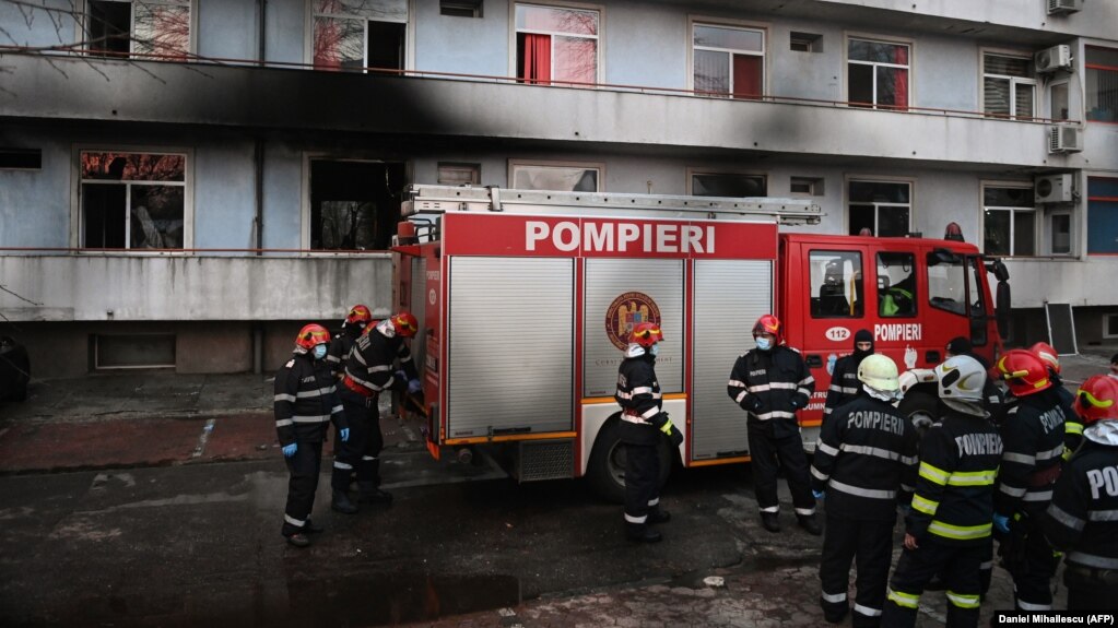
October 2021: a fire at the Constanța Hospital for Infectious Diseases killed seven patients, all of them in the ICU.
November 2021: a fire at a hospital for infectious diseases in Ploiești killed two patients, the fourth deadly hospital blaze in Romania in a year.
In each of these incidents, oxygen was a contributing factor, either as the accelerant that turned a small electrical fault into a rapidly spreading fire, or as part of the infrastructure failure that removed the margin between a patient’s safety and catastrophe. Since the outbreak of the pandemic, incidents of oxygen-related hospital fires in various countries caused over 200 deaths.
A SMOGGIE-GAS or MODEL INDUSTRIAL unit configured with an oxygen sensor can monitor O₂ concentration continuously. Medical oxygen levels are expressed as percentage by volume.
Set: Oxygen (O₂) above 25% VOL
Normal air is 20.9%. A reading of 23% in a confined space is elevated. At 25%, the risk of fire and explosion from any ignition source is significantly increased. At 30%, it is acute.
The scenario: a bedside oxygen line develops a slow leak in a four-bed ICU bay at night. O₂ concentration climbs from 21% to 26% over forty minutes. The sensor, mounted on the wall or ceiling, detects the rise and triggers an alert. A staff member receives a notification, identifies the leaking connection and eliminates it before any ignition source is introduced. Nobody is harmed.
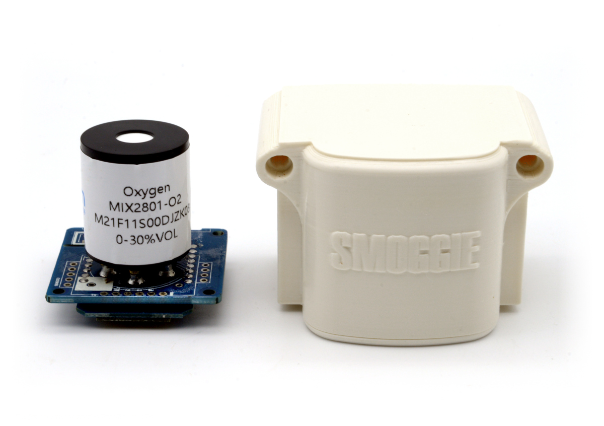
The question of how many lives this would have saved is not answerable precisely. But in a country that recorded more than 30 hospital deaths from fire in a single year, in wards where oxygen was part of the fuel, continuous environmental monitoring with immediate alerting is not a theoretical safeguard. It is a practical one, available today, at the cost of a wall-mounted sensor.
But this is also the right place for a disclamer. By the nature of the technology used, any sensor can potentially fail to meet specification without warning. We make every effort to ensure reliability of all sensors but where life safety is a performance requirement of the product and, where practical, we recommend that all gas sensors and instruments using sensors are checked for response to gas before use. We accept no liability for any consequential losses, injury or damage resulting from the use of the uRADMonitor products. Customers should test the sensors under their own conditions to ensure that the sensors are suitable for their own requirements and in accordance with the plans and circumstances of the specified project and any standards / regulations pertaining to the country in which the sensors will be utilised.
A long time coming
Threshold alerts were on the development list for longer than we would like to admit. The infrastructure for it, the sensor network, the calibrated measurements, the per-device dashboard, was always there. What was missing was the closed loop that converts observation into action. But with high quality sensors now deployed, with the hardware part done, it was time to improve the software as well.
The dashboard rewrite had been overdue for just as long. Its tables dated from a time when a large account held five sensors, and they had been quietly getting worse ever since. Shipping both together was deliberate: a notification system is only as good as the interface used to configure it, and asking someone to set up a threshold in a thirteen-column table is a good way to ensure they never do.
The same reasoning extends to the shop and, in time, to the rest of the site. One visual language, one theme switch, one set of behaviours, working the same way on a monitor and on a phone.
The uRADMonitor network exists because measurement at scale matters. A single sensor reading is a data point. Ten thousand sensor readings, continuously updated, from locations across the world, form a picture. But a picture you have to look at to act on is only useful if you are already looking. An alert that finds you when something changes is what makes the network actively protective rather than passively informative.
We built this to be as unobtrusive as possible. The default cooldown keeps the volume low. The permission model lets institutions share access without surrendering control. The delete button is the only mechanism you need to silence something.
Log in to your dashboard and set your first threshold. It takes thirty seconds, and from that moment the network is watching with you.

codemore code
~~~~