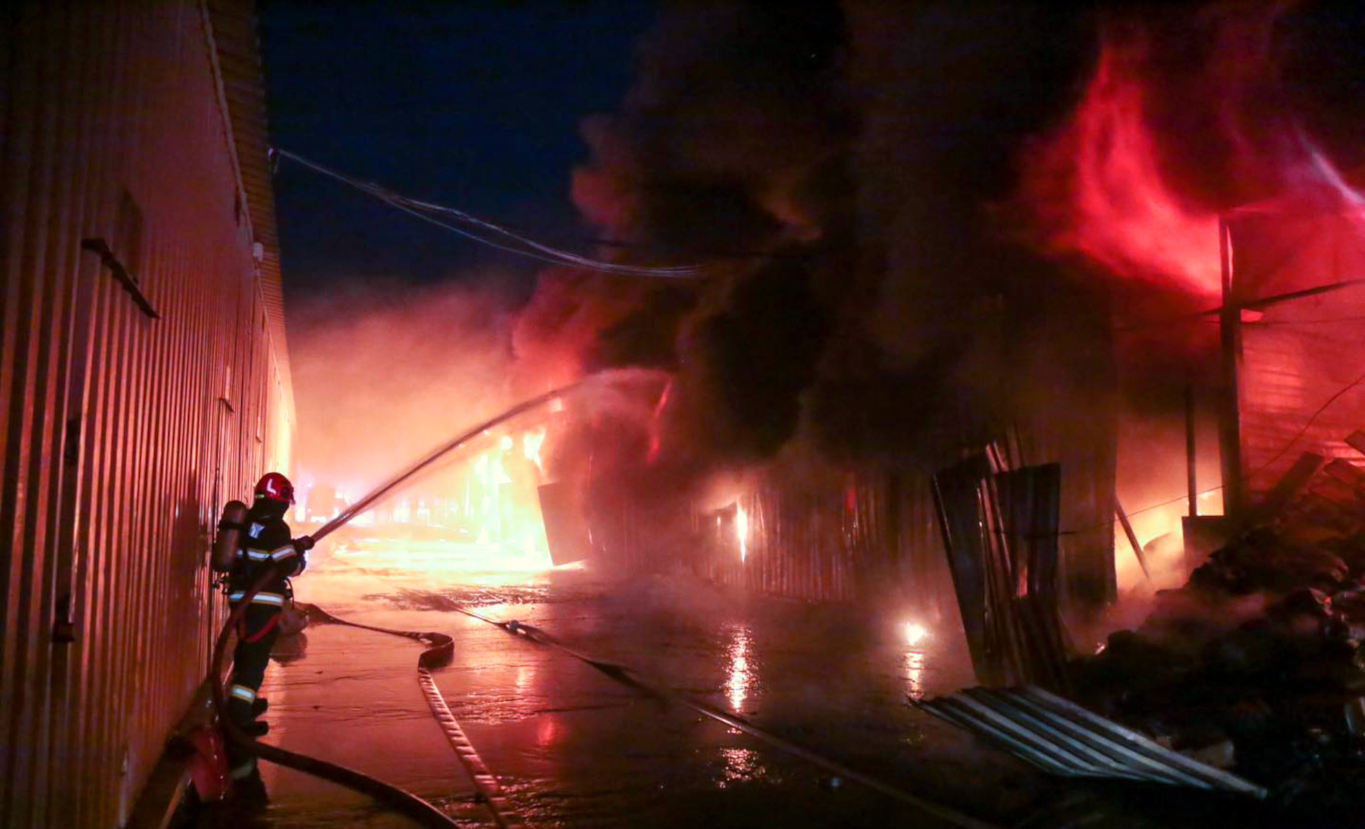
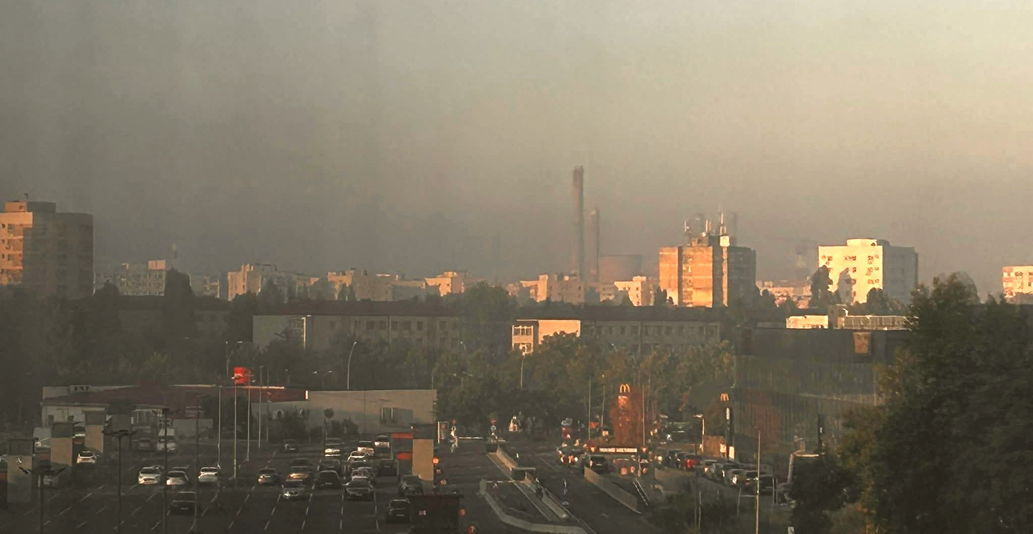
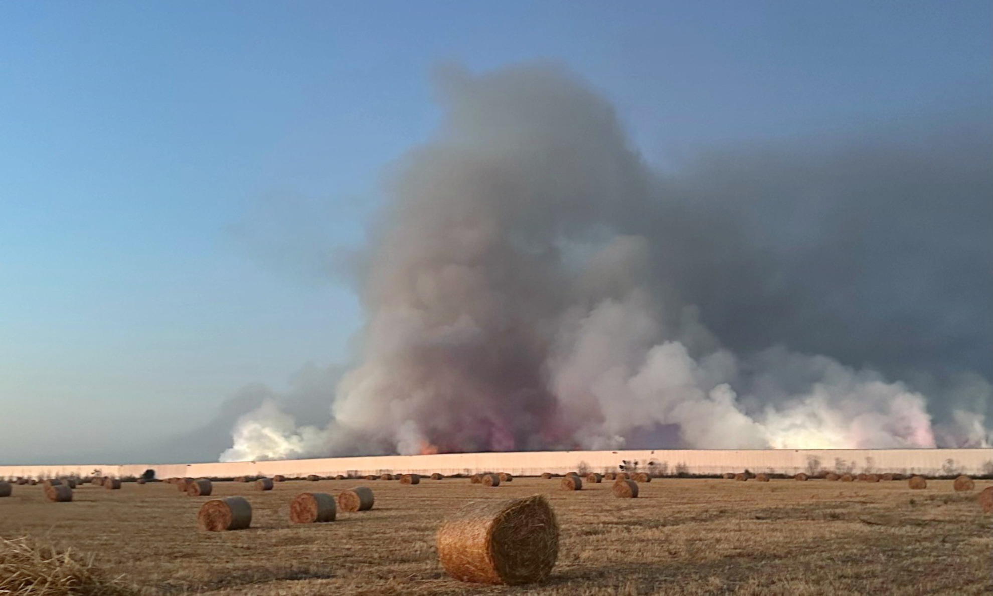
On the morning of August 27, 2025, Bucharest woke up under a toxic cloud. A massive fire at the Dragonul Roșu commercial complex in Pantelimon sent thick smoke drifting across the city, with acrid air reported as far as Berceni and downtown Unirii. Official monitoring stations recorded pollution levels up to ten times above normal, with fine particles (PM10 and PM2.5) reaching values dangerous for public health.
What residents experienced directly – burning eyes, suffocating air, alerts from the authorities, was also captured in real time by environmental sensors spread across the city. But beyond isolated readings, the challenge was to see the bigger picture: how exactly did the smoke spread across neighborhoods, and how fast?
This event became the trigger for a new feature on our platform: an interactive timeline slider for sensor data. The new feature was put in place during the day, despite complicated high-volume data algorithms that had to be implemented for this to work in real time.
The tool allows users to scroll back in time, hour by hour, and watch an animated replay of pollution levels on the city map. Each step of the slider corresponds to real sensor measurements, and the animation shows the smoke plume drifting with the wind from on a complex pattern, otherwise impossible to identify. Instead of static numbers, we can now visualize the story of an environmental disaster as it unfolded and can get a clue on the part of the population that was directly affected.
Technically, the solution is simple but powerful:
- A timeline slider allows users to select any hour from the past 24 hours (*)
- Pollution data (PM10, PM2.5 or any other parameter selected) is rendered dynamically on the map.
- By clicking the slider you can create an animation effect that replays the spread of pollution, turning raw data into a clear visual narrative.
Note (*): For performance reasons, the slider only becomes available when the map is sufficiently zoomed in, since each query places a significant load on our data servers. Please use this feature responsibly. To protect the system, the uRADMonitor Shield module can automatically block requests that generate excessive load. Should that happen, you won’t be able to use the service for up to one hour.
For citizens, this means greater awareness. Instead of just being told “the air is bad”, they can now see when the pollution peaked, which direction it traveled, and how long it lingered.
For us, the Bucharest fire was not only a tragic environmental episode but also a turning point. It highlighted why sensor data must move beyond charts and raw numbers, and instead provide intuitive tools that tell the full story. The uRADMonitor platform now does exactly this: it transforms complex sensor data into real-world models that show how pollution spreads and how it affects our daily lives and health. A clear indicator warns residents about outdoor conditions, including guidance for vulnerable groups, so people can immediately understand when the air is dangerous and when it’s safer to stay inside. Just a few years ago, this kind of actionable insight would have been impossible.
The smoke has long dispersed. But with this new visualisation system, the lessons it left behind will remain visible. Perhaps next time we’ll find us all better prepared.
codemore code
~~~~