- This topic has 3 replies, 2 voices, and was last updated 6 years, 2 months ago by
Beniamin Ciuta.
-
AuthorPosts
-
April 4, 2020 at 10:02 am #7084
Ovidiu Neghina
Participanthi
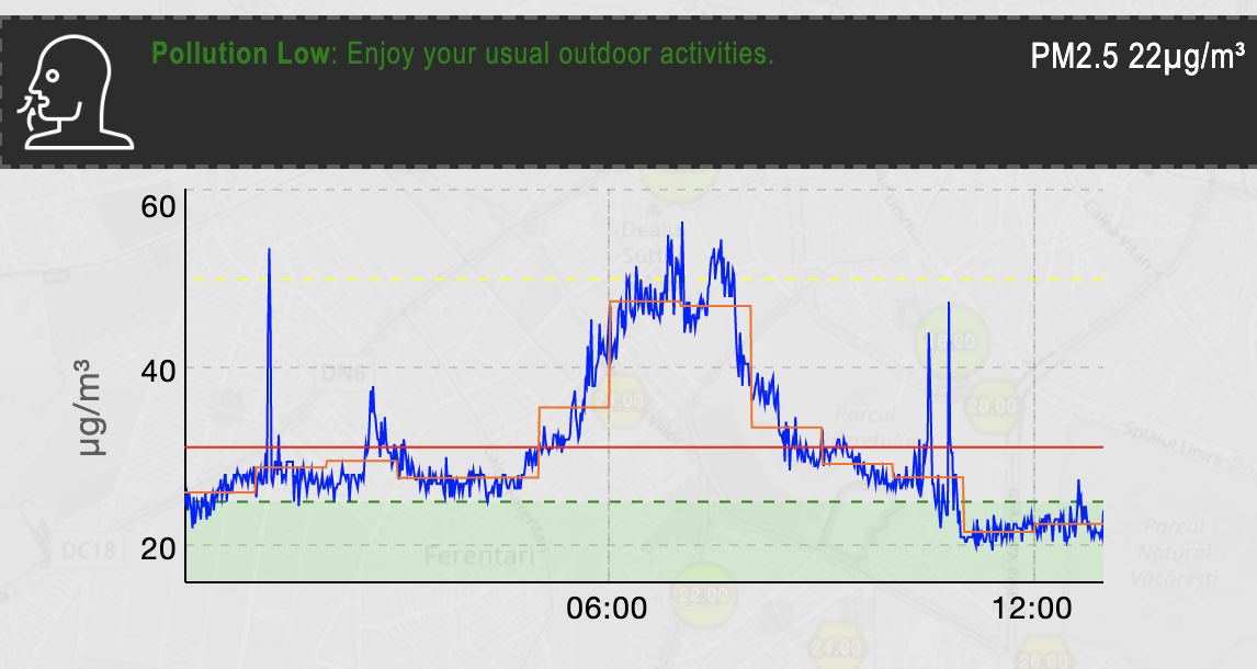
i got a smoogie and i want to understand what the color of the lines in the PM2.5 dashboard mean ?
the green, the red, the yellow.Same questions for the rest of the dashboard(after clicking on the details)
Thanks a lot.
April 4, 2020 at 6:41 pm #7088Beniamin Ciuta
ParticipantHi Ovidiu!
I will try to explain what I understand from the graphics.
All graphics for the different elements/factors are similar. They are similar in what is the colouring of the different levels of impact that every factor has on the ambient/surroundings.
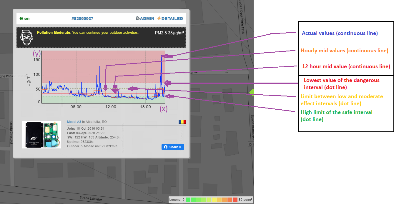
I will be referring to the vertical (Y) column which contains, depending on the selected factor, the different values. The horizontal column stands for time (12 hours)So the green marked interval comprises the values from 0 to the upper safe value of every factor (for example: aprox. 23 µg/m3 for PM2.5 particles) and ends with the green horizontal dot line. This refers to a safe interval for each factor.
The next up-going interval is not coloured, but has the upper limit marked with a yellow horizontal dot line (for PM2.5 the dot line would be at aprox. 50 µg/m3). This one refers to low a effect of the factor.
There is another uncoloured interval which is between the yellow and the red quadrants, which I consider the orange quadrant, even if it’s maximal line is not visible, for being covered by the red dot line, where the red interval begins. The values within the orange interval would be interpreted as a moderate impact/effect of the factor. The red interval has no limit and its values indicate a high/big impact of the factor to the ambient/surroundings.Now, referring to the values marked with blue, red and orange continuous lines, which are the actual measured values by the devices and which are noted in different time stamps (from left to right) you have to understand the following:
The blue line stands for the factor actual value (where the level of PM2.5 is at a certain time, for example);
The red continuous line stands for a mid value of the factor, for the last 12 hours;
The orange continuous line stands for an hourly mid value of the factor, indicating what was the medium level at each hour.I this is useful for you and everyone else reading this!
Stay healthy and breathe clean air!Attached there is sketch of my explanation.
Attachments:
April 10, 2020 at 4:11 am #14131Participantiti multumesc mult de tot !
May 7, 2020 at 4:55 pm #28359ParticipantCu mare plăcere!
-
AuthorPosts
- You must be logged in to reply to this topic.