One of uRADMonitor’s major components – the server side – is responsible for receiving data from the distributed hardware units and pack it in its databases. We are talking about large volumes of data, that are scaled up with each new device entering the network.
The server is also handling the web portal, where we can see the actual results for the radiation measurements. A caching mechanism is set in place to speed up the response time, but in a few words when you access a radiation chart, the data is taken form the database, averaged according to the specified parameters and a new chart is generated. All these operations are consuming, and we had to invest in providing enough hardware server power for this project.
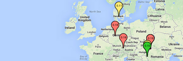
To make data visualisation more appealing, the map has been updated to show the pinpoints in colour, and with the last radiation dose value as a label. This value influences the colour of the pinpoints. Black are those offline, green are areas with radiation dose under 0.10uSv/h, yellow for under 0.17uSv/h and red for bigger doses. But these numbers are the very last values, that are non integrated (averaged) so for better indications click the pinpoints to open the detailed view where you can also see the trend for these numbers.

This gives a much better overview and I am looking forward to a heat map when there is enough stations to draw detailed information like that.
The black pin for offline units is visually taking too much attention, maybe it is better if it was grayed out to fall more into the background?
Done. Thanks for the tip!
Hello everyone. I run an electronics club here at Ridgeway College in Limpopo, South Africa. We do have internet and would be interested in participating. How could we get hold of a Rad Monitor?
Chris
What does it mean when it is black AND online?
Hi Waheed,
That’s a little bug in current implementation, that is already fixed for the new server software ( http://dev.uradmonitor.com ).
What’s happening there is that for the [online] indicator we measure activity for the last 5 minutes, while for the map marker we use the average dose computed over the last 24h.
When a new unit is connected, there is no average to show, but there is activity in the last 5 minutes interval. This is why for new units we see the green indicator, but the black marker on the map.
As said, this is already fixed in the new implementation. Hopefully it will go online soon.